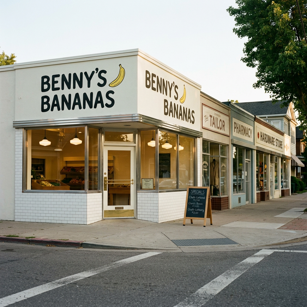
A neighbourhood greengrocer's painted signage translated into a direct-to-consumer banana brand — the visual warmth of a 1960s fruit crate label meeting the restraint of a modern Scandi pantry staple.
- Nostalgic without being sentimental — referencing the past without romanticising it or faking patina
- Playful without being quirky — illustrations and hand-drawn gestures that feel warm, not winking or self-consciously whimsical
- Simple without being stark — minimalism with personality, not the cold emptiness of tech-brand restraint
- Honest without being earnest — straightforward language that doesn't slip into manifesto-speak or preachy wholesomeness
“You'd recognise it by the restrained yellow and the feeling that it's been your neighbourhood grocer for fifty years, even if you discovered it yesterday.”
Benny's Bananas occupies the exact space where a 1960s neighbourhood greengrocer's counter meets a modern Scandi pantry staple. The brand world is built from the honest materials of mid-century produce retail—subway tile kept clean, butcher block worn smooth by decades of arranging fruit, chrome scales with gentle patina, kraft paper that creases with real use. Typography borrows the confidence of hand-painted shopfront signs: bold Trade Gothic headlines that read from across the street, restrained Inter for the everyday facts. Classic Banana yellow repeats until it becomes synonymous with the name, supported by Grocer Green accents and Butcher Block warmth against Subway Tile White. The voice talks about bananas the way your greengrocer would—'These ones are ready now, those'll be better Thursday'—straightforward without trying to prove anything. Photography documents rather than styles: north-facing window light, medium depth of field, the quiet pride of fruit arranged with care on counters where material quality speaks louder than marketing. Nothing manufactured. Nothing over-designed. Dependable as a Thursday routine.
- Butcher block grain worn smooth by decades of arranging bananas
- White subway tile with visible grout lines catching morning light
- Chrome counter scales showing gentle patina from years of honest use
- Kraft paper creased naturally from wrapping, not styled rusticity
- Wooden crate slats stacked with the rhythm of horizontal gaps between boards




Straightforward and friendly without trying too hard. Talks about bananas the way your neighborhood grocer would—honest about what's good today, what's not quite ready, what'll be perfect tomorrow.
- +Use contractions naturally
- +Name specific details
- +Acknowledge trade-offs honestly
- +Keep sentences short and clear
- +Speak peer-to-peer
- +Say what things actually are
- –Never use superlatives or hype
- –Skip corporate softeners entirely
- –Don't oversell or exaggerate
- –Avoid marketing speak
- –No 'we believe' or 'passionate'
- –Never condescend or explain basics
Logos, palette, fonts, voice, positioning, audience.
“You'd recognise it by the restrained yellow and the feeling that it's been your neighbourhood grocer for fifty years, even if you discovered it yesterday.”
What this brand really is
A neighbourhood greengrocer's painted signage translated into a direct-to-consumer banana brand — the visual warmth of a 1960s fruit crate label meeting the restraint of a modern Scandi pantry staple.
Everyman because the brand refuses to make fruit precious or aspirational — it's grounded in neighbourhood reliability and the anti-hero posture of 'just bananas'. Caregiver emerges in the tenderness of language ('treated with care', 'served with a smile') and the implicit promise of dependable nourishment without fuss.
Benny's Bananas began as a question: why had fruit become so complicated? Founder Benny Caruso grew up in his family's Brooklyn greengrocer in the 1960s, where his grandfather arranged bananas each morning like they mattered—because to the neighbourhood, they did. After years in corporate food distribution, Benny returned to that single principle: pick well, handle gently, deliver reliably. No manifesto, no farm-to-table theatre. Just the quiet discipline of doing one thing right, every day, the way small shops used to before everything got redesigned.
“Every bunch treated with the same care as if it were sitting in your neighbour's fruit shop, where quality was a matter of pride, not marketing.”
What we believe
To deliver consistently good bananas with the care and reliability of the neighbourhood greengrocer that knew your name.
Where boutique organic brands charge a premium for provenance theatre and commodity grocers treat fruit as anonymous inventory, Benny's occupies the honest middle—dependable quality without the markup or the manifesto, the anti-hero of the produce aisle that refuses to make bananas precious.
- Nostalgic without being sentimental — referencing the past without romanticising it or faking patina
- Playful without being quirky — illustrations and hand-drawn gestures that feel warm, not winking or self-consciously whimsical
- Simple without being stark — minimalism with personality, not the cold emptiness of tech-brand restraint
- Honest without being earnest — straightforward language that doesn't slip into manifesto-speak or preachy wholesomeness
- Familiar without being generic — looking like it's always existed but never like everything else in the aisle
Who we're for
The 35–55 year old who still buys from the butcher by name and remembers when grocers arranged fruit like it mattered. Works in creative or knowledge fields, lives in inner-ring suburbs or gentrifying neighbourhoods, seeks quality through execution not marketing.
35–55, household income $75k–$150k, urban and inner-suburban across metro areas
Values craft over convenience, mistrusts performative authenticity, believes good things should look like good things without trying. Tired of brands that explain themselves too much. Wants the reassurance of systems and standards, not stories.
- Shops at independent grocers and co-ops even when inconvenient
- Researches provenance quietly — reads labels, asks questions, never broadcasts the effort
- Buys the same trusted items repeatedly rather than chasing novelty
- Prefers brands that understate rather than oversell
- Notices design details (typography, paper stock, finishing) without needing to discuss them
- Avoids anything that looks like it's performing wholesomeness or heritage
- To live in a world where quality is assumed, not advertised
- To be the kind of person who knows good things quietly
- To rebuild the neighbourhood economy one purchase at a time
How we sound
Straightforward and friendly without trying too hard. Talks about bananas the way your neighborhood grocer would—honest about what's good today, what's not quite ready, what'll be perfect tomorrow.
The neighbourhood grocer's matter-of-fact warmth—honest about ripeness, consistent in care, never overselling what the fruit already is.
“Ready today. Perfect by Wednesday. Still good Friday.”
“Bananas that arrive when they should”
“We've been buying from the same three farms in Ecuador since 1987. They know our standards—we know their seasons. When the bananas arrive here, they've spent exactly six days in transit, which means they're green enough to ripen properly in your kitchen. We check every box before it goes out.”
“Shipment went out this morning. Tracking says Thursday delivery, which means weekend ripeness if you leave them out.”
“Order by Tuesday”
“Your bananas arrive green on purpose—they'll ripen on your counter over three or four days, which means you control when they're ready.”
- Use contractions naturally
- Name specific details
- Acknowledge trade-offs honestly
- Keep sentences short and clear
- Speak peer-to-peer
- Say what things actually are
- Never use superlatives or hype
- Skip corporate softeners entirely
- Don't oversell or exaggerate
- Avoid marketing speak
- No 'we believe' or 'passionate'
- Never condescend or explain basics
How we look
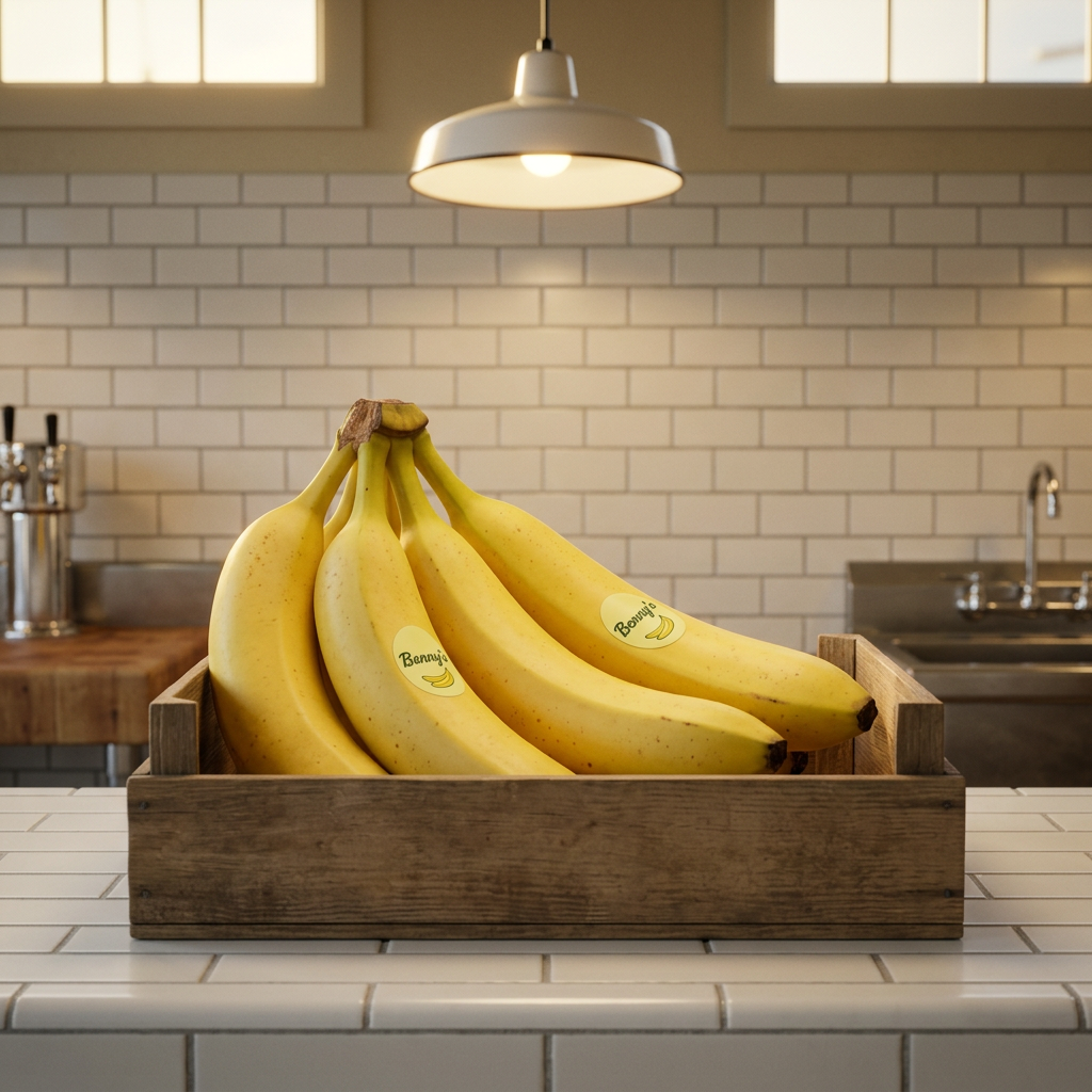
Mid-century produce counter materials under north-facing light—subway tile, worn butcher block, honest chrome, kraft paper—documented with straight photographic clarity.
- Butcher block grain worn smooth by decades of arranging bananas
- White subway tile with visible grout lines catching morning light
- Chrome counter scales showing gentle patina from years of honest use
- Kraft paper creased naturally from wrapping, not styled rusticity
- Wooden crate slats stacked with the rhythm of horizontal gaps between boards
See the hero above for the palette, type specimens, and moodboard that follow from this philosophy.
Where we sit
- Natural/organic food brands must show the product unadorned — real fruit, real texture, no studio gloss
- Heritage cues (crate typography, paper ephemera) are expected and credible in produce branding
- Warm earth tones signal wholesomeness and are category-standard for anything claiming 'honest' provenance
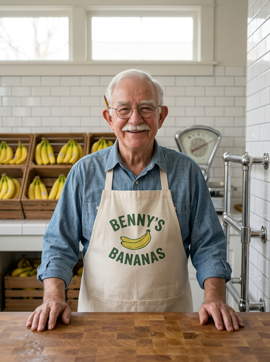
- No founder-as-hero storytelling or farmstead photoshoots with rolled sleeves and golden hour — this brand has no face, only fruit
- Refuse the DTC wellness aesthetic (clinical whites, sans serif manifestos, ingredient callouts) — this is a grocer not a supplement
- Avoid the rustic-maximalist move (burlap textures, chalkboard fonts, distressed everything) — nostalgia here is clean not cluttered
- The distressed vintage filter — no faux-aged paper textures, no artificially weathered type, no Photoshop grunge overlays
- The millennial farmers' market aesthetic — mason jars, chalkboard menus, Edison bulbs, reclaimed wood as decoration rather than material fact
- Overly geometric sans serifs (Futura, Gotham) that make the brand feel designed rather than inherited
- Stock photography of hands holding fruit in soft focus — any image where the human gesture is more prominent than the product
- The cute-illustration trap — anthropomorphised bananas with faces, puns about 'going bananas', anything that reads as a children's brand masquerading as adult
- Heavy drop shadows, bevels, or 3D type effects attempting to mimic vintage signs but landing in 1990s Photoshop nostalgia
What we offer
Benny's Bananas is a direct-to-consumer banana delivery service that brings greengrocer-level curation and care to your doorstep. We source consistently excellent bananas, time shipments to your preferred ripeness, and communicate honestly about what's ready now versus what needs a few days on your counter—just like the neighbourhood fruit shop that knew exactly when to pick for you.
“The Ripeness Promise—we ask when you want to eat your bananas, then time the shipment so they arrive at exactly the right stage, whether that's ready-today yellow or give-them-three-days green.”
- 01Weekly banana subscriptions (timed to ripeness preference)
- 02One-time banana boxes (perfectly ripe or ready-to-ripen)
- 03Ripeness concierge service (we ask when you want to eat them)
- 04Seasonal variety boxes (Cavendish, Lady Finger, Burro when available)
- 05Banana care guide with every shipment
- 06Gift subscriptions in vintage-style packaging
- 07Wholesale accounts for independent cafés and bakeries