Command center control — AI triage reveal
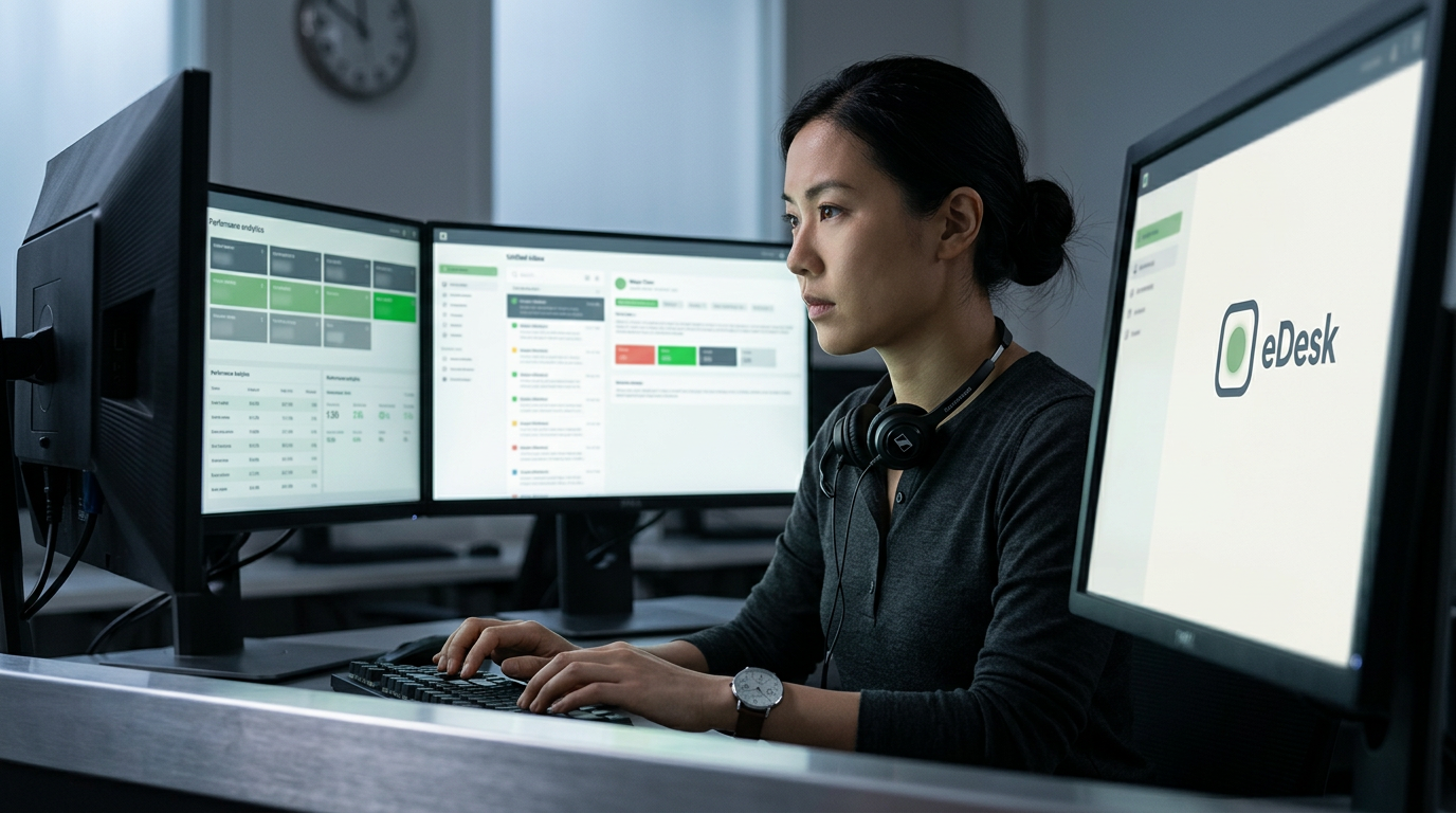
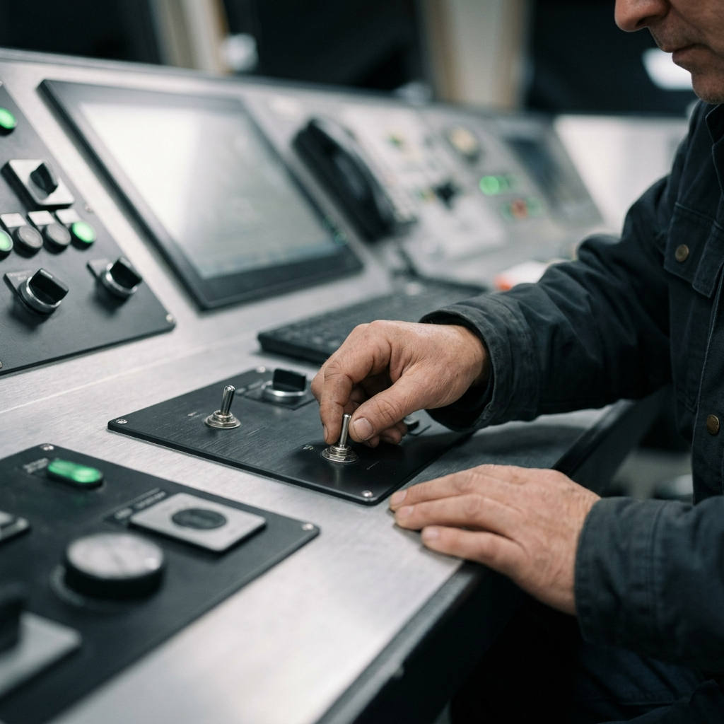
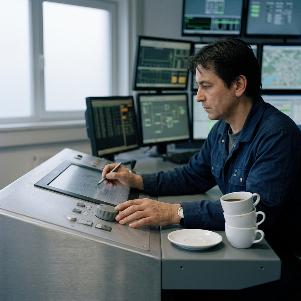
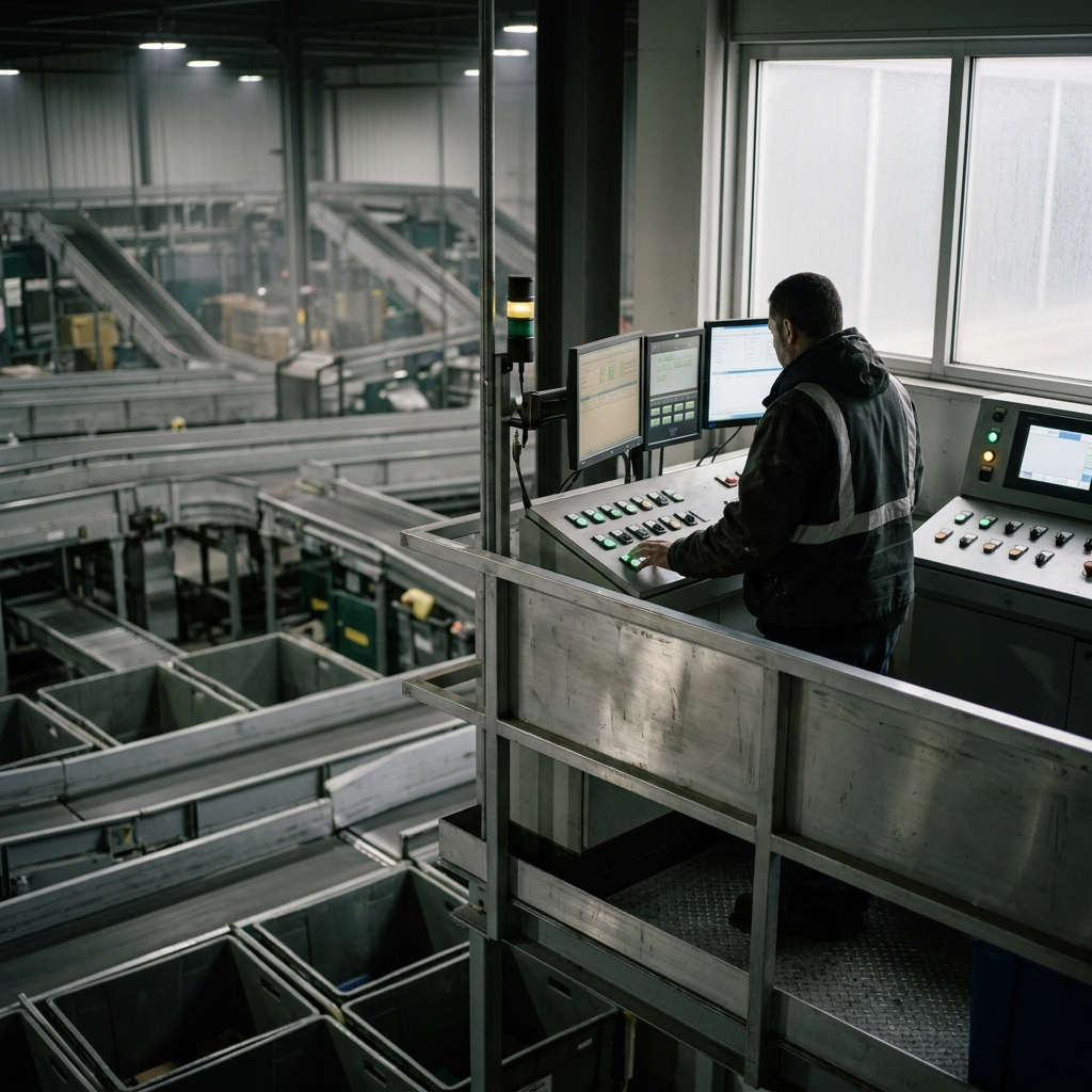
Brand: "EDesk". Brand world: EDesk is the control panel for e-commerce support operations under load — where air traffic control clarity meets triage-nurse efficiency. The brand speaks in the clipped precision of technical documentation: short declarative sentences, active verbs, zero apologizing for complexity. Visually, it lives in the world of aerospace instrumentation and industrial design manuals — medium-format photography isolating brushed aluminum surfaces, backlit dashboard displays, hands operating precision tools with shallow depth of field. Control Room Slate and Dashboard Steel ground the palette; Signal Green punctuates the interface like status indicators on critical systems. Suisse Int'l headlines cut through noise, DM Sans body text maintains operational clarity, GT America Mono marks data with monospaced authority. This is not the cheerful SaaS startup with illustrated high-fives — it's the 3am sorting facility running at steady hum, the surgical theatre where every element earns its place or gets deleted. The brand promises relief through control: when your queue explodes to 10,000 tickets, EDesk renders chaos as solvable signal. Visual signature: Medium-format documentation photography: shallow focus on brushed metal and backlit displays, diffused north light, tactile precision without aspiration, the honest beauty of functional systems performing under load. Visual anchors: Backlit dashboard displays glowing cool green against matte black housing; Brushed aluminum surface with directional machining grain catching diffused light; Operator's hands adjusting precision controls with shallow depth of field; Industrial sorting facility conveyor system at pre-dawn blue hour; Cockpit instrument panel: analog gauges and toggle switches designed for high-stakes clarity. Edge: The only helpdesk that photographs like aerospace documentation — you'd recognize it by the surgical restraint and the refusal to illustrate teamwork with cartoon characters. soft warm light, intimate framing, real hands and faces, photography, Medium-format photographic realism with editorial restraint — the visual register of technical manuals and aerospace documentation elevated through deliberate composition. High-contrast clarity without harshness, shallow depth of field isolating critical information like focus points in a service manual. Surfaces rendered with tactile precision: brushed aluminum, matte glass, the soft glow of backlit displays. Lighting evokes operating theatre precision and cockpit instrumentation — cool, even, functional. No lifestyle aspiration or team celebration; instead, the honest documentation of systems performing under load, hands engaged with interfaces, the quiet choreography of professional tools being used well., diffused north light through frosted glass, cool-neutral 5000K, high local contrast with soft global falloff, no direct sun, operating theatre clarity without clinical harshness, 50mm equivalent focal length, f/2.8 shallow depth of field isolating foreground subjects, gentle bokeh on background elements, medium-format sensor sharpness, precise focus plane separation, brushed aluminum with directional grain, matte powder-coated steel, anti-glare glass with subtle fingerprint resistance, injection-molded ABS polymers, fine mesh speaker grilles, machined precision with visible tolerances, non-reflective functional finishes, tactile but not decorative, tool-grade durability signals, surfaces that invite purposeful interaction not admiration, control room at 3am, pre-dawn sorting facility, surgical precision without clinical coldness, palette skews towards #2C3E50 control room slate, #546E7A dashboard steel, #4CAF50 signal green, no readable text or lettering or signage anywhere, Maya Chen monitoring triple-monitor command center at 3am, tight chest-up framing excluding top-of-head, slight profile angle showing concentrated expression lit by screen glow, left monitor displays Performance Analytics Module with 847 total tickets visible as dense grid, center screen shows Unified Inbox Dashboard with AI-routed queues color-coded in cool greens and grays, right monitor isolates 12 exception tickets flagged in Signal Green accent, Maya's hands hover over mechanical keyboard mid-gesture, wired Sennheiser headset rests around neck, charcoal merino henley, dark hair in low bun, simple watch with multiple time zone subdials catching backlit display glow, background soft-focus showing empty Command Center Office workstations in pre-dawn darkness, industrial clock on far wall shows 03:17, diffused north light from frosted glass partition mixing with cool monitor glow creates operating-theatre lighting, narrow depth of field keeps focus plane razor-sharp on Maya's concentrated face and nearest screen quadrant, brushed aluminum desk edge in sharp focus bottom frame, matte black housing of monitors shows directional machining detail, composition uses rule-of-thirds with Maya at left intersection point and exception-flagged screen occupying right two-thirds, overall register resembles aerospace cockpit documentation photography — tactical precision without aspiration, the honest beauty of functional systems triaging chaos into signal [REVISION REQUEST — the previous output didn't land. Apply this feedback verbatim: Replace all dashboard mockup text with real, approved copy or legible EDesk-branded UI labels; remove nonsensical placeholder strings.] [REVISION REQUEST — the previous output didn't land. Apply this feedback verbatim: Use the correct eDesk logo from the website]

Final composed prompt
Brand: "EDesk". Brand world: EDesk is the control panel for e-commerce support operations under load — where air traffic control clarity meets triage-nurse efficiency. The brand speaks in the clipped precision of technical documentation: short declarative sentences, active verbs, zero apologizing for complexity. Visually, it lives in the world of aerospace instrumentation and industrial design manuals — medium-format photography isolating brushed aluminum surfaces, backlit dashboard displays, hands operating precision tools with shallow depth of field. Control Room Slate and Dashboard Steel ground the palette; Signal Green punctuates the interface like status indicators on critical systems. Suisse Int'l headlines cut through noise, DM Sans body text maintains operational clarity, GT America Mono marks data with monospaced authority. This is not the cheerful SaaS startup with illustrated high-fives — it's the 3am sorting facility running at steady hum, the surgical theatre where every element earns its place or gets deleted. The brand promises relief through control: when your queue explodes to 10,000 tickets, EDesk renders chaos as solvable signal. Visual signature: Medium-format documentation photography: shallow focus on brushed metal and backlit displays, diffused north light, tactile precision without aspiration, the honest beauty of functional systems performing under load. Visual anchors: Backlit dashboard displays glowing cool green against matte black housing; Brushed aluminum surface with directional machining grain catching diffused light; Operator's hands adjusting precision controls with shallow depth of field; Industrial sorting facility conveyor system at pre-dawn blue hour; Cockpit instrument panel: analog gauges and toggle switches designed for high-stakes clarity. Edge: The only helpdesk that photographs like aerospace documentation — you'd recognize it by the surgical restraint and the refusal to illustrate teamwork with cartoon characters. soft warm light, intimate framing, real hands and faces, photography, Medium-format photographic realism with editorial restraint — the visual register of technical manuals and aerospace documentation elevated through deliberate composition. High-contrast clarity without harshness, shallow depth of field isolating critical information like focus points in a service manual. Surfaces rendered with tactile precision: brushed aluminum, matte glass, the soft glow of backlit displays. Lighting evokes operating theatre precision and cockpit instrumentation — cool, even, functional. No lifestyle aspiration or team celebration; instead, the honest documentation of systems performing under load, hands engaged with interfaces, the quiet choreography of professional tools being used well., diffused north light through frosted glass, cool-neutral 5000K, high local contrast with soft global falloff, no direct sun, operating theatre clarity without clinical harshness, 50mm equivalent focal length, f/2.8 shallow depth of field isolating foreground subjects, gentle bokeh on background elements, medium-format sensor sharpness, precise focus plane separation, brushed aluminum with directional grain, matte powder-coated steel, anti-glare glass with subtle fingerprint resistance, injection-molded ABS polymers, fine mesh speaker grilles, machined precision with visible tolerances, non-reflective functional finishes, tactile but not decorative, tool-grade durability signals, surfaces that invite purposeful interaction not admiration, control room at 3am, pre-dawn sorting facility, surgical precision without clinical coldness, palette skews towards #2C3E50 control room slate, #546E7A dashboard steel, #4CAF50 signal green, no readable text or lettering or signage anywhere, Maya Chen monitoring triple-monitor command center at 3am, tight chest-up framing excluding top-of-head, slight profile angle showing concentrated expression lit by screen glow, left monitor displays Performance Analytics Module with 847 total tickets visible as dense grid, center screen shows Unified Inbox Dashboard with AI-routed queues color-coded in cool greens and grays, right monitor isolates 12 exception tickets flagged in Signal Green accent, Maya's hands hover over mechanical keyboard mid-gesture, wired Sennheiser headset rests around neck, charcoal merino henley, dark hair in low bun, simple watch with multiple time zone subdials catching backlit display glow, background soft-focus showing empty Command Center Office workstations in pre-dawn darkness, industrial clock on far wall shows 03:17, diffused north light from frosted glass partition mixing with cool monitor glow creates operating-theatre lighting, narrow depth of field keeps focus plane razor-sharp on Maya's concentrated face and nearest screen quadrant, brushed aluminum desk edge in sharp focus bottom frame, matte black housing of monitors shows directional machining detail, composition uses rule-of-thirds with Maya at left intersection point and exception-flagged screen occupying right two-thirds, overall register resembles aerospace cockpit documentation photography — tactical precision without aspiration, the honest beauty of functional systems triaging chaos into signal

[REVISION REQUEST — the previous output didn't land. Apply this feedback verbatim: Replace all dashboard mockup text with real, approved copy or legible EDesk-branded UI labels; remove nonsensical placeholder strings.]

[REVISION REQUEST — the previous output didn't land. Apply this feedback verbatim: Use the correct eDesk logo from the website]

[BRAND QA CORRECTION — the previous render failed automated brand verification.
Recreate the SAME scene and composition, fixing ONLY these violations:
- logo_fidelity: Redraw the app icon exactly as the locked logo: dark slate rounded-square outline with a soft-glow green circle centered inside, at correct proportions relative to the 'eDesk' wordmark.
- no_invented_text: Remove or replace all invented dashboard copy and the 'TRANSCRIBED' text with only the approved brand text 'EDesk' or generic non-legible placeholder UI elements.
Hard rules for this retry:
- Reproduce the attached logo reference EXACTLY, letterform-for-letterform. Do not re-draw, re-space, re-colour or re-spell the wordmark.
- Remove ALL readable text, lettering, labels and signage except the approved brand mark; render those surfaces blank or texture-only.
]
- logo_fidelitywarnThe icon on the right-hand monitor matches the locked logo's rounded-square/green-dot structure, but the green dot appears more muted/desaturated and the square outline slightly thinner than the reference, giving a flatter, less vibrant colourway.Fix: Re-render the logo icon using the exact locked green (#4CAF7A-ish saturated green) and slate-blue stroke weight from the approved mark.
- no_invented_textfailThe left and center monitor screens display garbled, illegible pseudo-text meant to look like dashboard UI copy (e.g. 'Perfomance andlytics', 'Perfomance metrics', assorted unreadable list rows and labels). None of this text is on the approved list and it reads as invented/gibberish product copy.Fix: Replace the dashboard screen mockups with either genuine approved UI copy or clean placeholder/lorem-style blocks that do not render as garbled pseudo-English text.