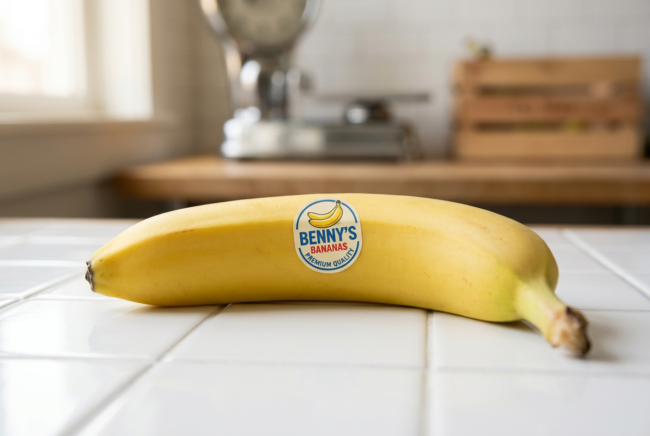
Benny's Bananas (restoration scratch)
Just bananas.
Identity
Palette
Typography
Voice
Straightforward and friendly without trying too hard. Talks about bananas the way your neighborhood grocer would—honest about what's good today, what's not quite ready, what'll be perfect tomorrow.
- “These ones are ready now—those'll be better Thursday.”
- “We get our bananas from the same farms we've used since 1987, which means we know exactly what to expect and when things are actually ripe.”
- “Not the cheapest, not the fanciest, just consistently good.”
Do
- Use contractions naturally
- Name specific details
- Acknowledge trade-offs honestly
- Keep sentences short and clear
- Speak peer-to-peer
Don’t
- Never use superlatives or hype
- Skip corporate softeners entirely
- Don't oversell or exaggerate
- Avoid marketing speak
- No 'we believe' or 'passionate'
Positioning
Audience
The 35–55 year old who still buys from the butcher by name and remembers when grocers arranged fruit like it mattered. Works in creative or knowledge fields, lives in inner-ring suburbs or gentrifying neighbourhoods, seeks quality through execution not marketing.
Essence
Benny's Bananas began as a question: why had fruit become so complicated? Founder Benny Caruso grew up in his family's Brooklyn greengrocer in the 1960s, where his grandfather arranged bananas each morning like they mattered—because to the neighbourhood, they did. After years in corporate food distribution, Benny returned to that single principle: pick well, handle gently, deliver reliably. No manifesto, no farm-to-table theatre. Just the quiet discipline of doing one thing right, every day, the way small shops used to before everything got redesigned.
Values
- Consistency
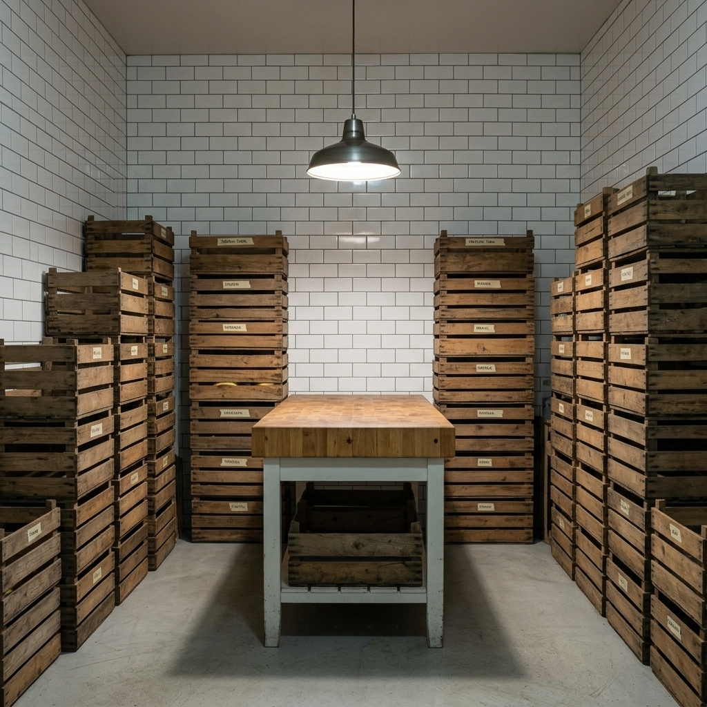
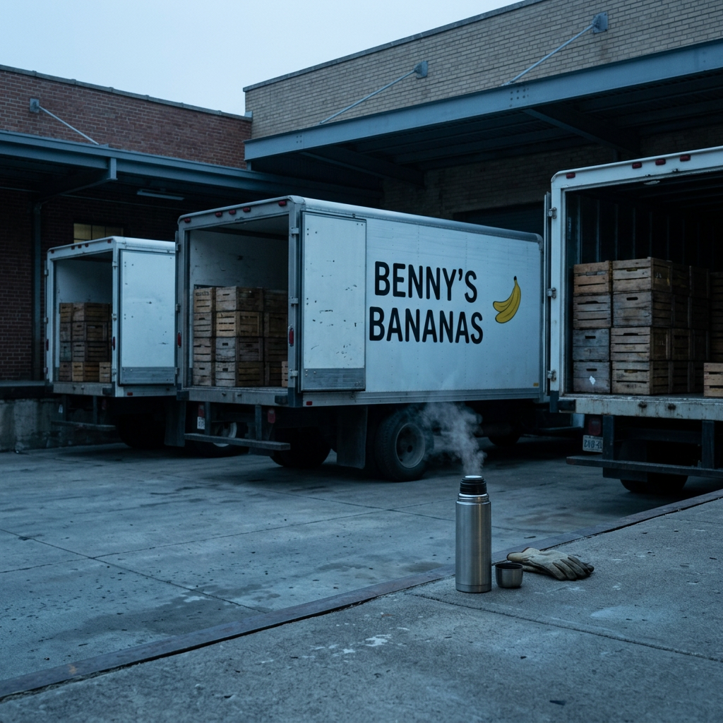
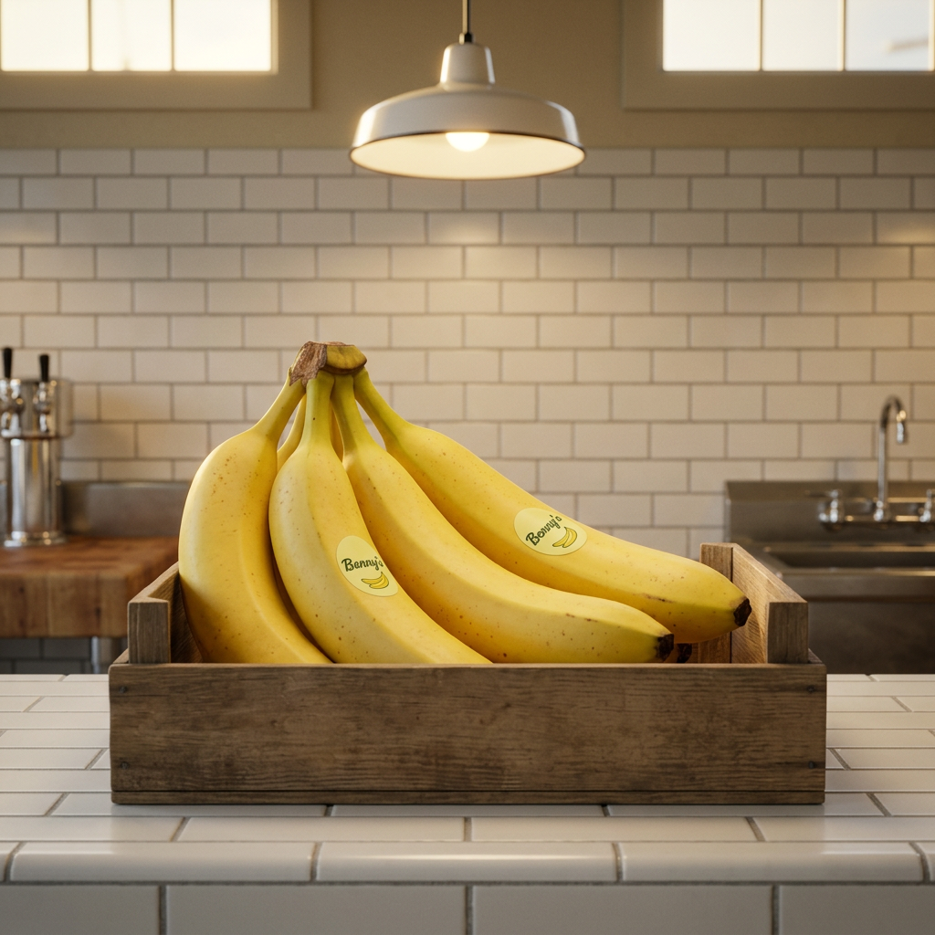
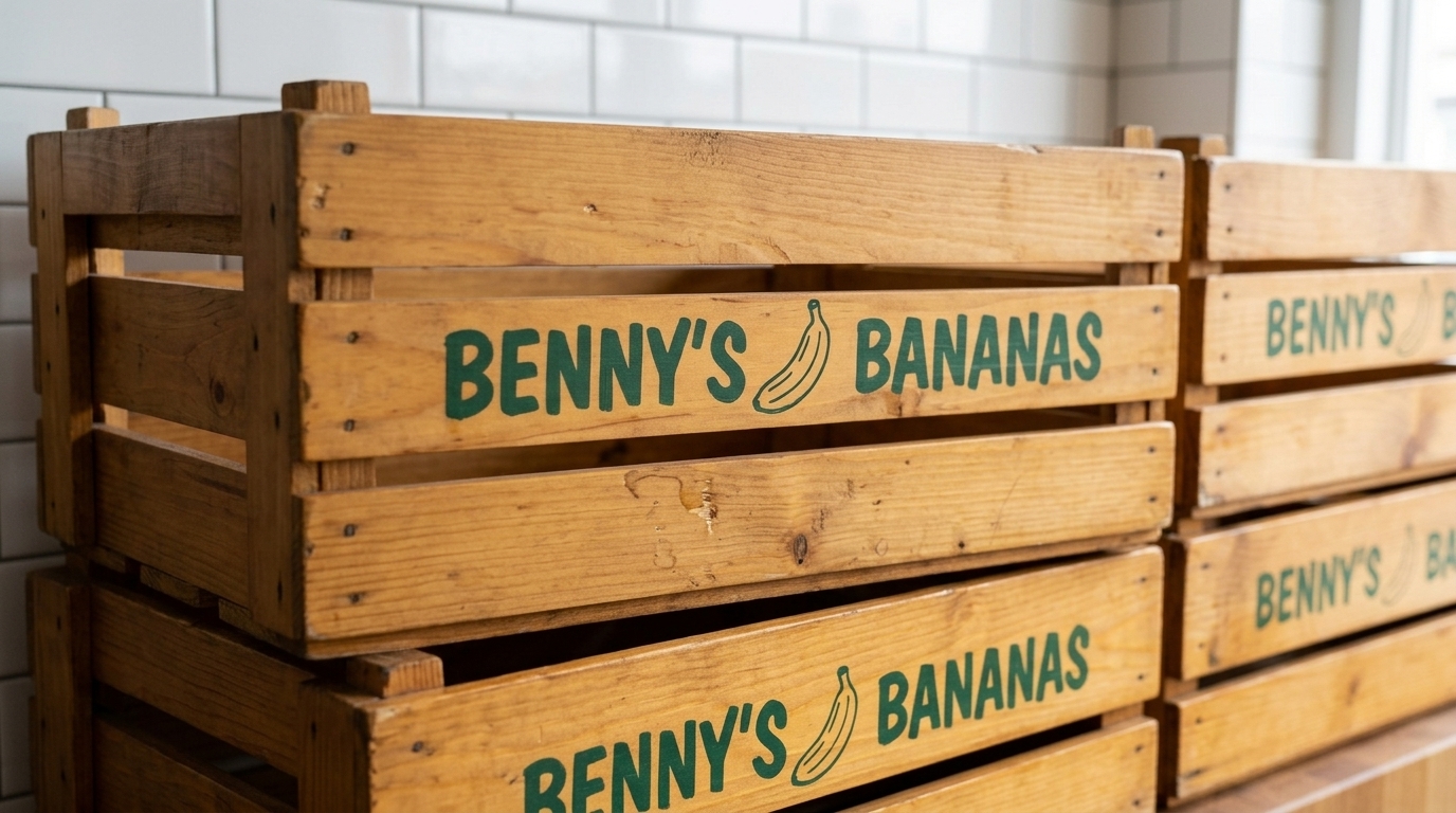
- Same Thursday routine, same crate placement, same dependable yellow—the discipline of showing up identically every time.
- Restraint
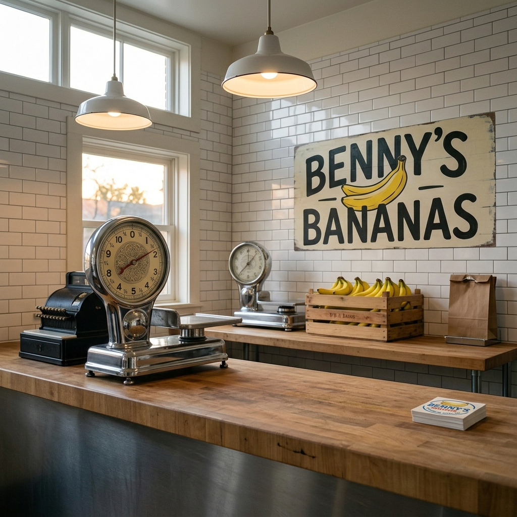
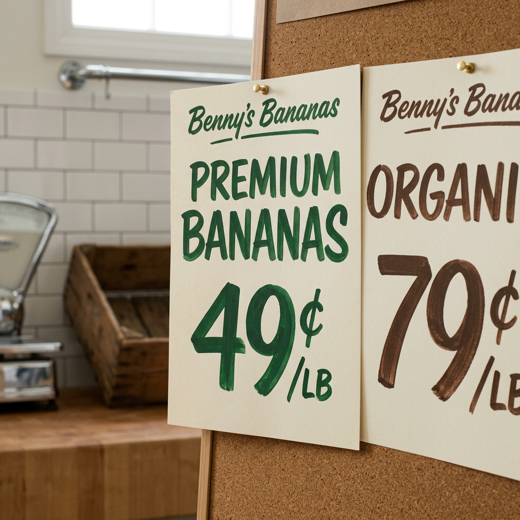
- The counter wiped clean, the sign with three words, the refusal to add what doesn't serve the fruit.
- Craft-as-care
- The way a greengrocer arranges bananas isn't decoration—it's the visible proof someone checked every bunch.
- Neighbourhood pride
- The kind of local reputation built hand-to-hand, week after week, where your name means your word.
- Honest goodness
- What the fruit is, not what we wish it were—ripe when it's ripe, imperfect when it's real, never oversold.
Logos

Visual direction
Style
Look
Feel
Moodboard


Shooting recipes
- Morning counter arrangement wide — 35mm, f/5.6, medium depth of field, three-quarter elevated angle, north-facing window light from left, soft diffused quality, slight tungsten warmth 3800K, even illumination across counter plane
- Butcher block grain detail tight — 50mm macro, f/2.8, shallow depth focusing on wood grain mid-frame, raking side light from north window, accentuating grain texture and worn smoothness, warm 4000K
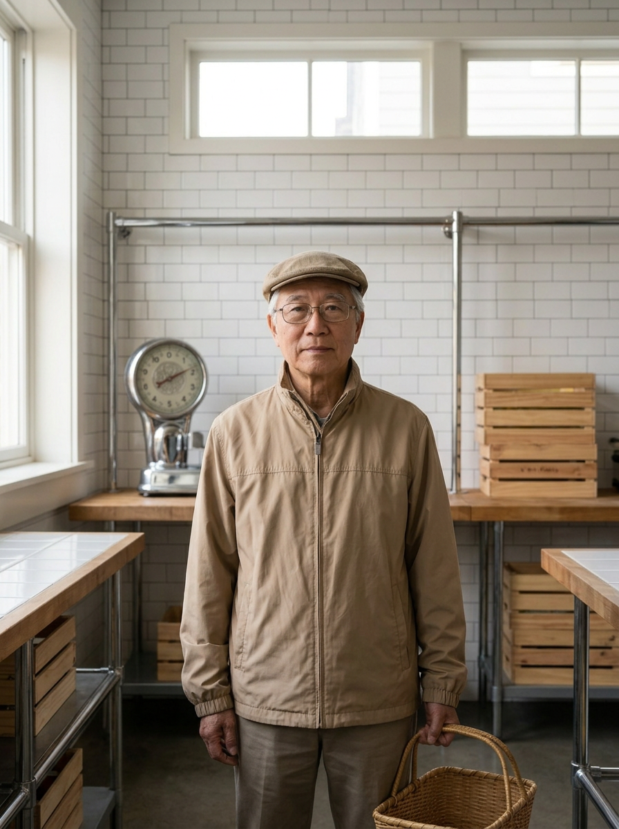
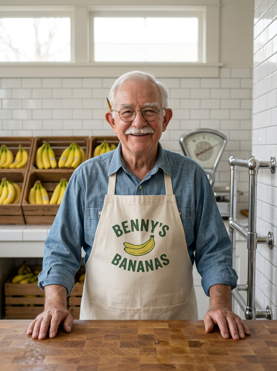
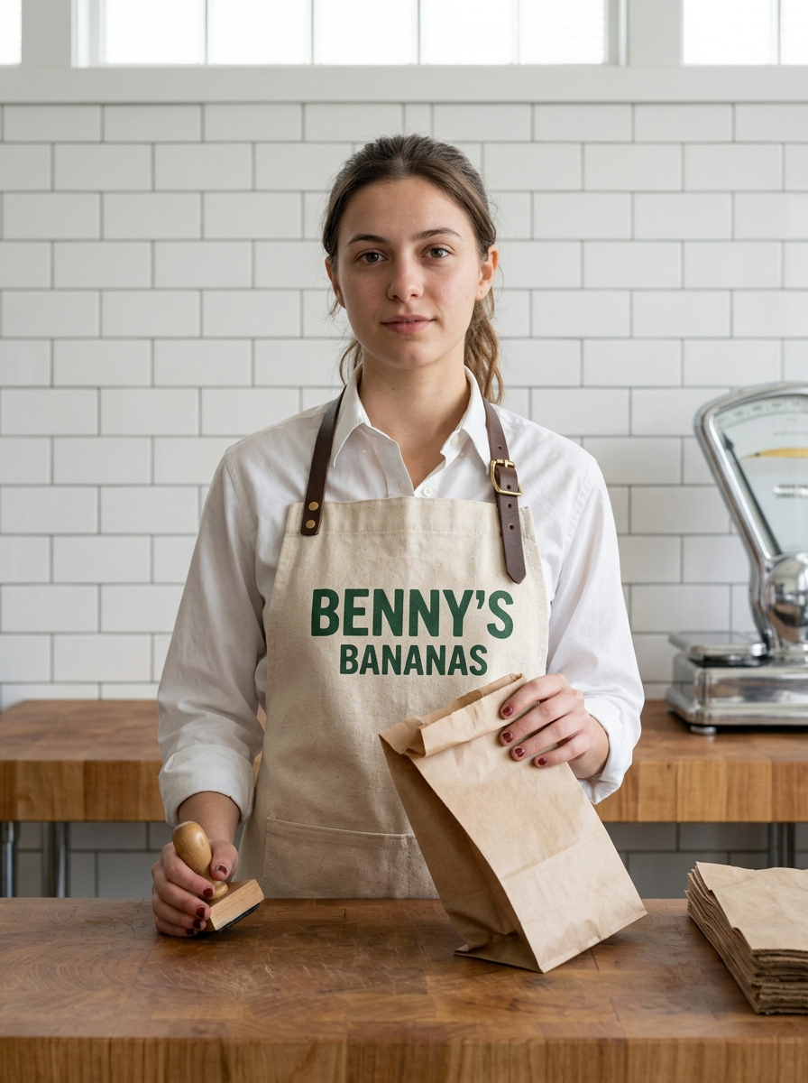
- Greengrocer portrait waist-up — 50mm, f/4, medium-sharp depth, waist-to-head framing centered, soft north window light wrapping from left side, gentle catchlight in eyes, minimal shadow under nose, 4200K natural
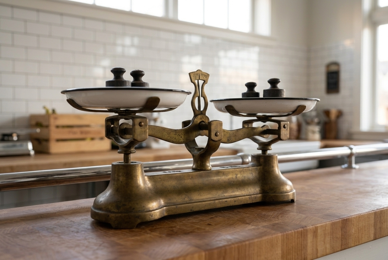
- Chrome fixture patina study — 50mm, f/2.2, selective focus on chrome surface mid-plane, diffused morning light creating soft highlights on polished chrome, gentle specular reflections showing use patina, 4500K cool-neutral
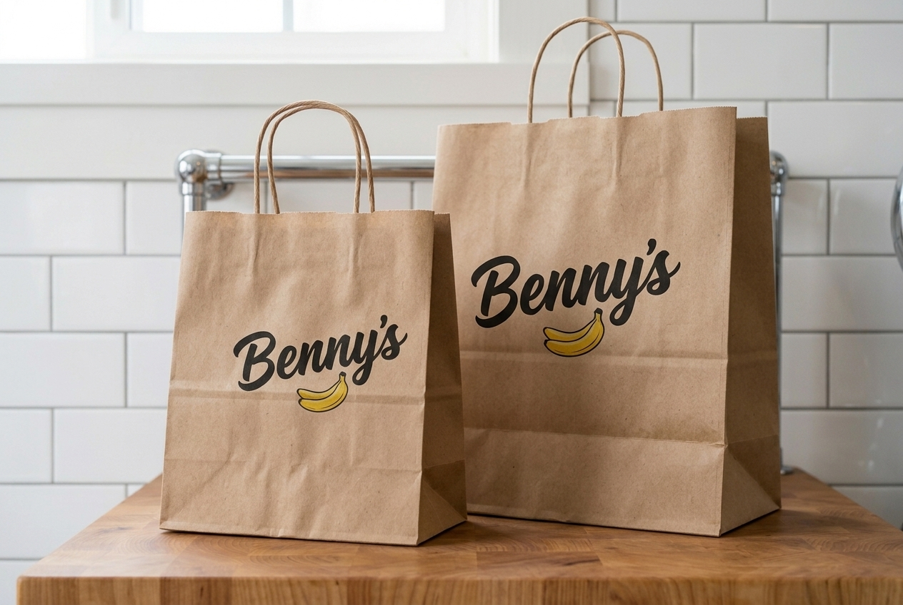
- Kraft paper wrap overhead flat — 50mm, f/8, deep depth, directly overhead perpendicular angle, even overhead north-facing skylight quality, shadowless diffusion, 5000K neutral-cool to show paper tone accurately
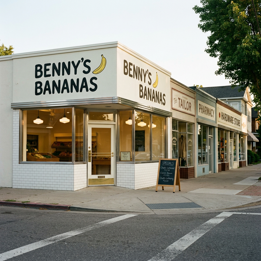
- Storefront street context environmental — 35mm, f/8, deep depth maintaining sharpness from foreground signage to mid-ground window display, overcast morning exterior light, soft shadowless quality, slight cool cast 5500K balanced for daylight accuracy
Cast
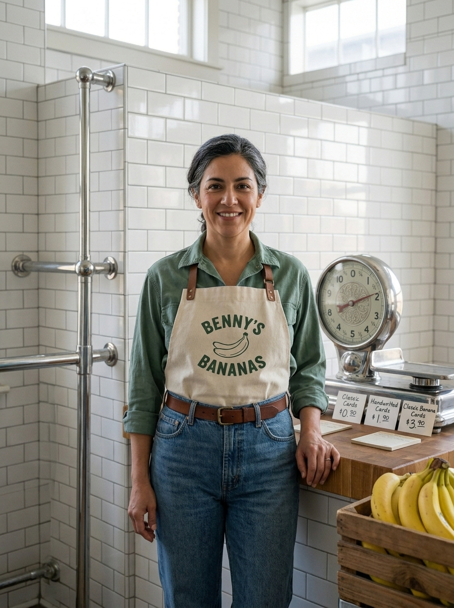
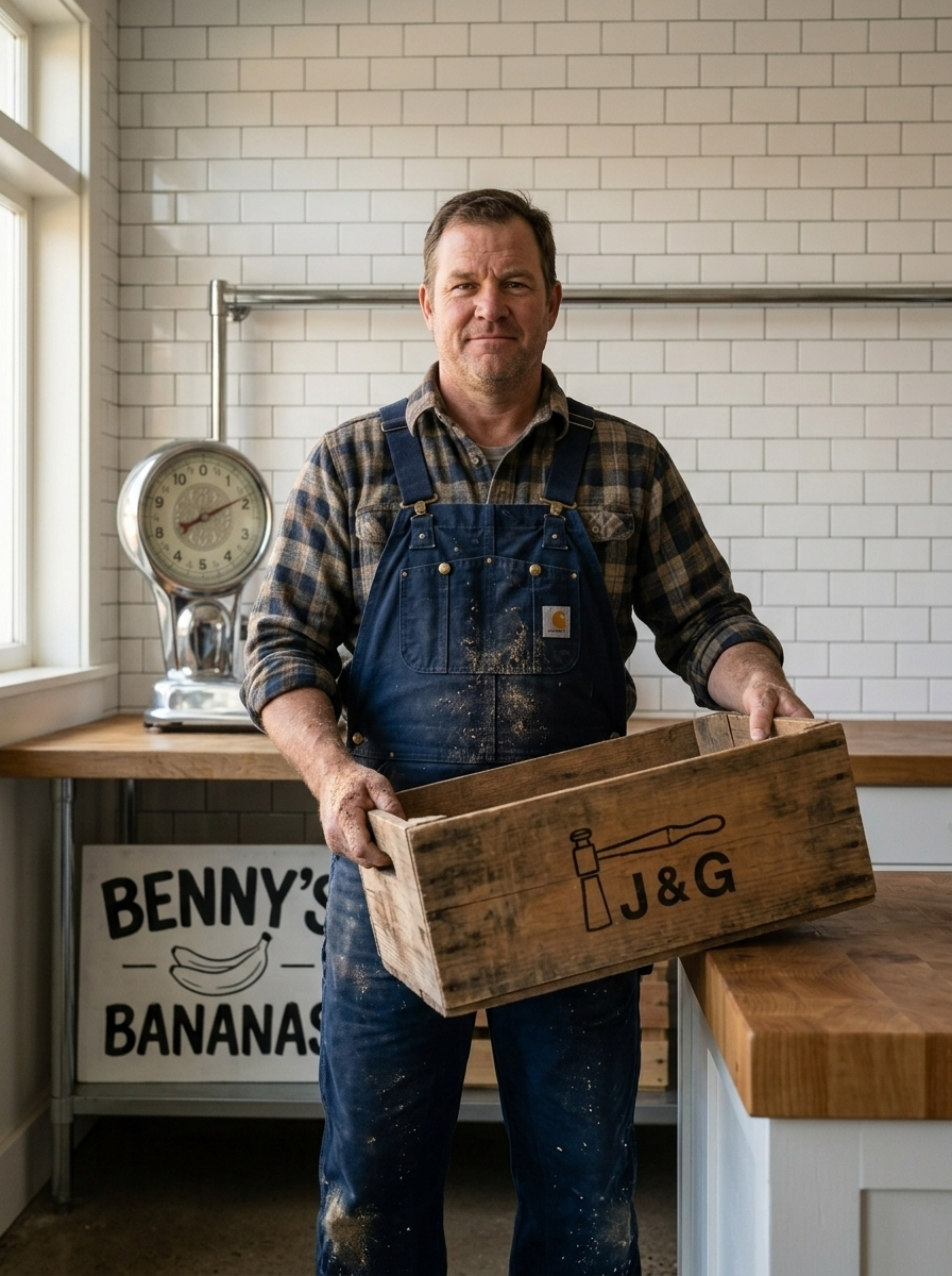
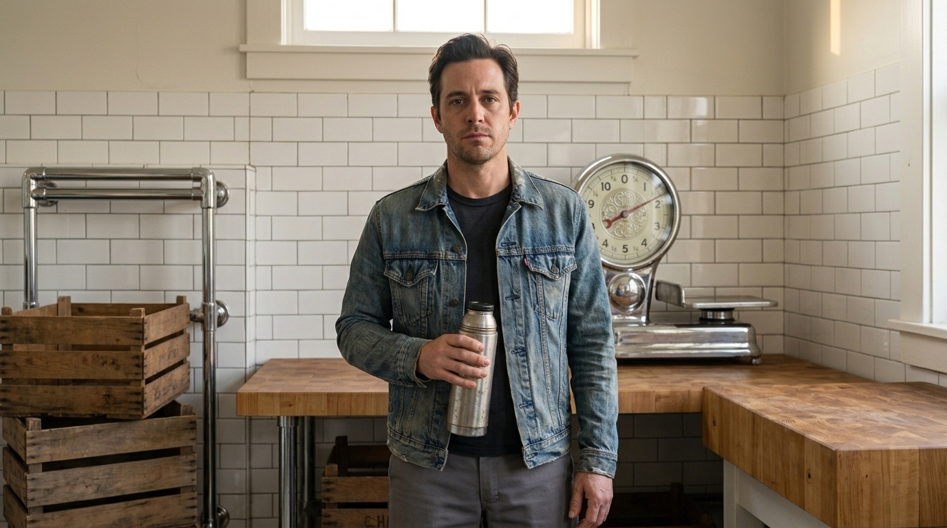
Characters
Locations
Products
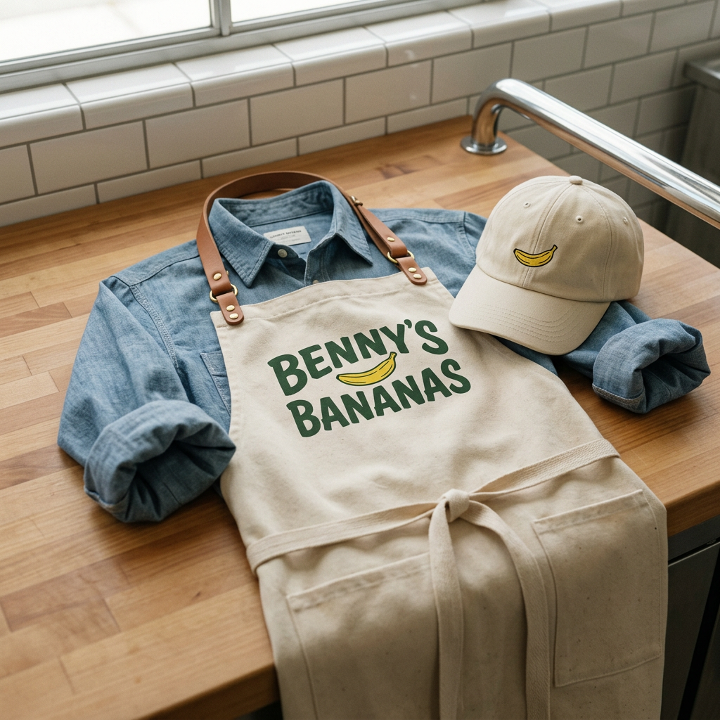
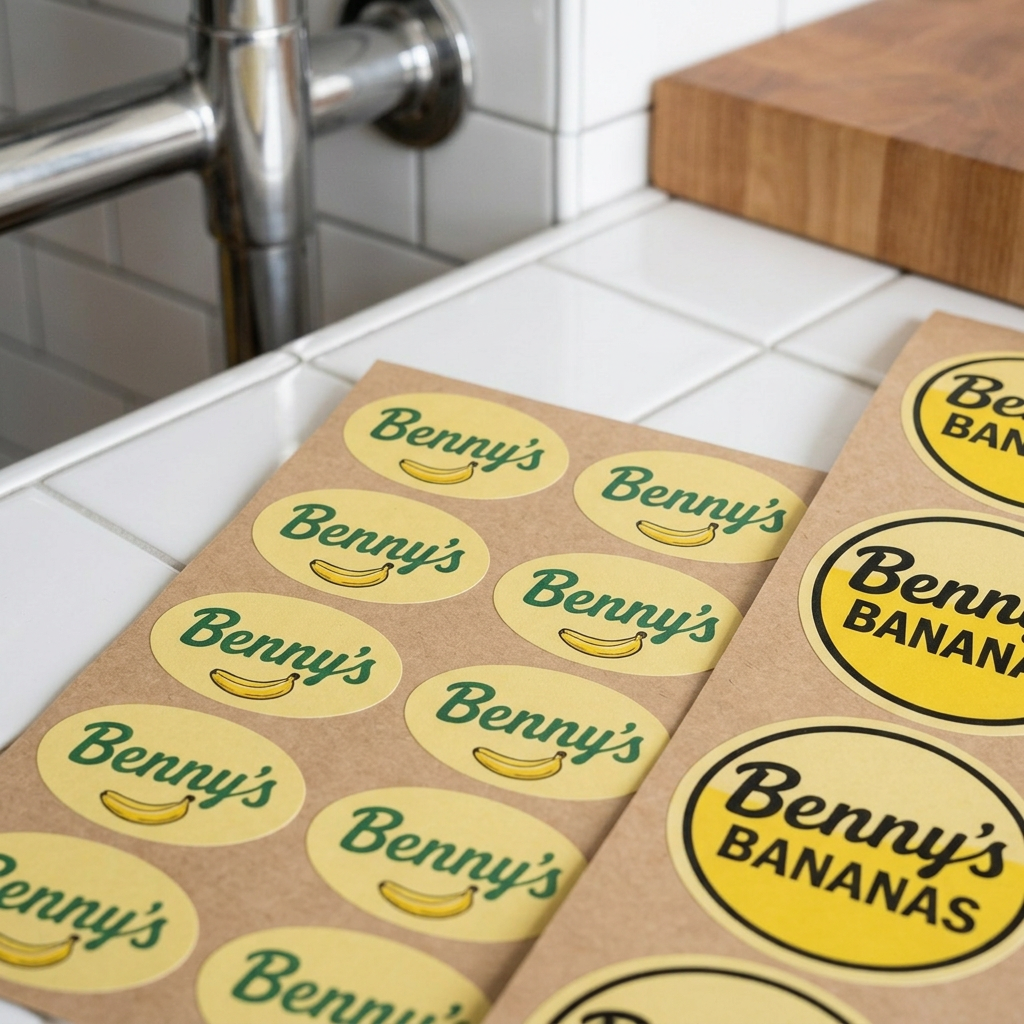
Applications


