← All assets
e2e two cans
photo·Status: ready·● pass
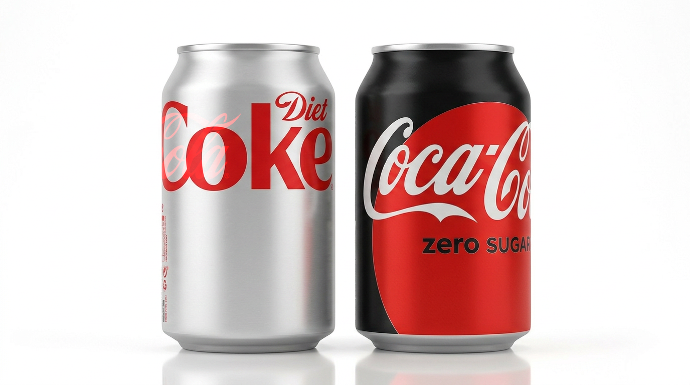
Prompt
@diet-coke and @coca-cola-zero-sugar side by side on white, studio packshot
On-brand scorecard
What happened
Exactly what was sent
Exactly what was sent
Modelfal-ai/nano-banana-2/editShot · tierbranded_surface · heroSeed130158471 (row)Recreatableclose match only (seedless model)Real logoprimary placed · verifiedCheckspass
References (8) — in the order the model saw them
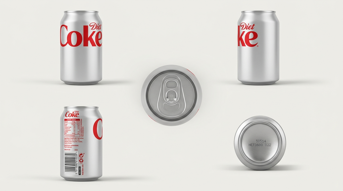
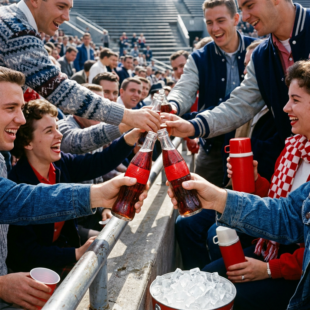
1. Canon · Diet Coke · sheet · generated — primary
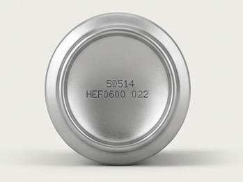
2. Canon · Diet Coke · detail · generated — coverage:detail
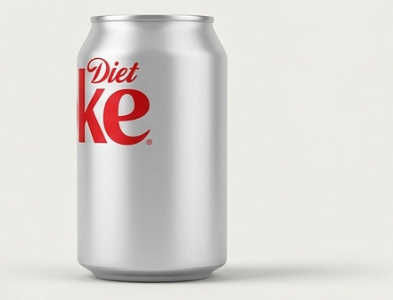
3. Canon · Diet Coke · front · generated — coverage:front
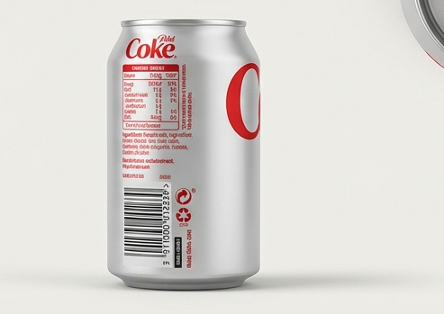
4. Canon · Diet Coke · back · generated — coverage:back
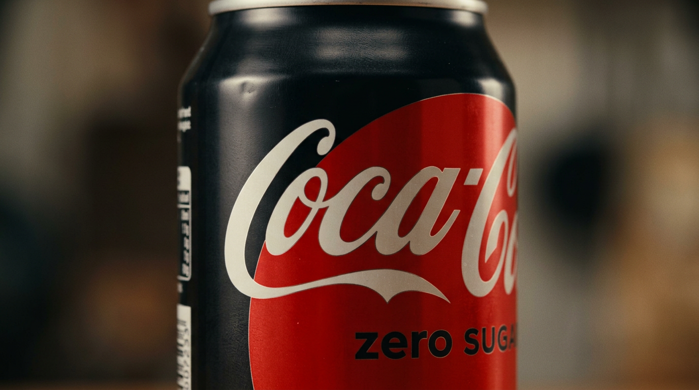
5. Canon · Coca-Cola Zero Sugar · detail · generated — primary
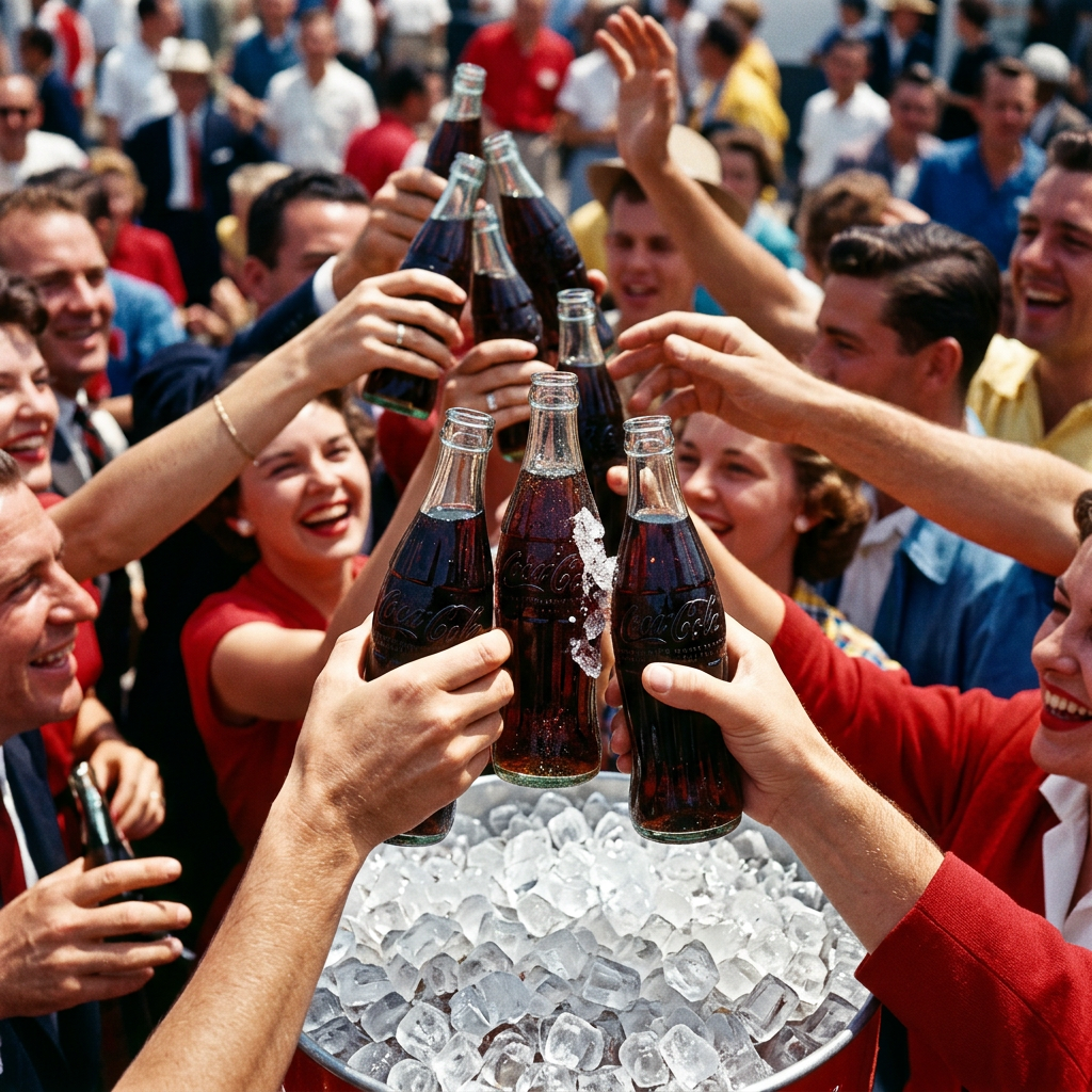
6. Brand world — moodboard_cell:0
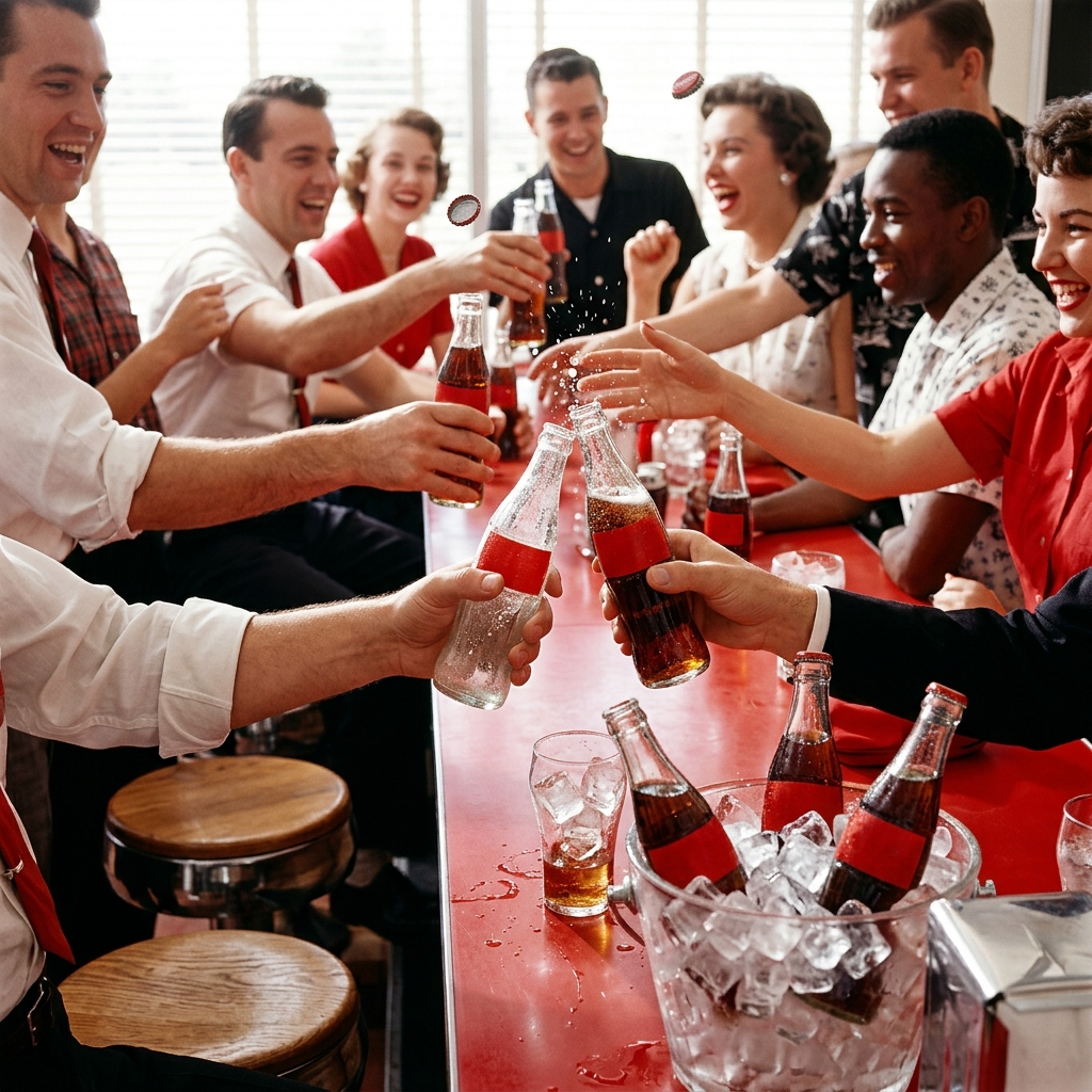
7. Brand world — moodboard_cell:1
8. Brand world — moodboard_cell:2
Prompt as sent to fal-nb2
Diet Coke (Diet Coke in its silver can with the red Diet Coke wordmark; slim, clean, silver-first livery.) and Coca-Cola Zero Sugar (Coca-Cola Zero Sugar in the black can with red accents and the white script wordmark.) side by side on white, studio packshot

=== PRODUCT SUB-PROMPT — Diet Coke ===
- Role: hero product
- Description: Diet Coke in its silver can with the red Diet Coke wordmark; slim, clean, silver-first livery.

=== VERIFIED UNDERSTANDING (vision-derived from the references) ===
- A standard slim aluminum beverage can in brushed silver, front-branded with the 'Diet Coke' wordmark in red script — 'Diet' in a small cursive script above the large bold 'Coke' logotype. The can has a plain silver body, silver top with a standard pull-tab opening, and a silver base stamped with production codes. The back/side panel carries a smaller red 'Diet Coke' logo, nutrition table, barcode, and recycling marks, all in red/black text on the silver surface.
- Finishes: matte-satin brushed metal body; glossy red printed logo; polished metallic lid and base
- Colorways: #C7C9CC body silver; #E2001A logo red; #FFFFFF small text areas; #1A1A1A fine print black
- Materials: brushed aluminum body; printed ink graphics
- Scale cues: consistent with standard 330ml/12oz soda can proportions
- Silhouette: straight-walled cylinder with narrow rolled rim top and slightly recessed base
- Form factor: standard slim aluminum beverage can
- Proportions: tall cylinder, height roughly 2.2x diameter, slightly tapered shoulder near top
- Marks and labels: 'Diet Coke' wordmark front, red script; smaller 'Diet Coke' logo on back panel; nutrition table; barcode; recycling/tidyman symbols; base stamped code '50514 HEF0600 022'
- Condition and wear: pristine, no dents, scratches, or discoloration visible
- Distinctive shapes: standard pull-tab can lid with oval opening; rolled top rim; recessed stamped base ring

=== INVARIANTS — must be identical in every render ===
- Red 'Diet Coke' script wordmark on silver body, front-facing
- Font style: cursive 'Diet' above bold condensed 'Coke'
- Overall silver-first body color (#C7C9CC) with red (#E2001A) branding only
- Standard pull-tab lid geometry and placement
- Back panel layout: small logo top, nutrition table, barcode, recycling marks below
- Base stamped code '50514 HEF0600 022'
- Can proportions: slim cylinder, height ~2.2x diameter
- No visible wear, dents, or print defects

=== ALLOWED VARIATION ===
- Camera angle and framing
- Lighting direction and intensity
- Background color or context
- Reflections and shadow style
- Condensation or droplets presence
- Can orientation (upright, tilted, lying down)

=== SPECIFICATION ===
- What it is: Diet Coke in its silver can with the red Diet Coke wordmark; slim, clean, silver-first livery.
- Form factor: Diet Coke in its silver can with the red Diet Coke wordmark; slim, clean, silver-first livery.
- Lettering policy: fidelity
- Photography do: fill most of the frame; emphasise material, surface quality and craft
- Photography don't: never distort proportions; never recolor the product

=== CONSISTENCY ===
Diet Coke must look identical in every image: same shape, materials, colours and markings as the reference images. Match the strong references exactly.

=== LETTERING POLICY ===
fidelity

=== REFERENCE COVERAGE ===
- Coverage 88% of required views
- Dedicated views: hero; back; detail
- Sheet-only views (weaker): side

=== OBSERVED DETAIL (vision-derived) ===
- Measured #c7c9cc — main can body
- Measured #e2001a — Diet Coke logo lettering
- Measured #ffffff — background and highlight areas
- Measured #1a1a1a — fine print nutrition text
- faint vertical brushed metal texture on body
- glossy raised-looking print on red logo areas
- matte pull-tab with visible rivet
- logo 'Coke' spans roughly 60% of can width
- top rim width approx 5% of can height
- base diameter roughly equal to top rim diameter
- script 'Diet' word above bold 'Coke' wordmark
- small back-panel logo reading 'Diet Coke' in smaller scale
- base code '50514 HEF0600 022'
- barcode and recycling symbols on back lower panel

=== NOT VISIBLE IN THE REFERENCES (do not invent — keep neutral) ===
- Interior of can not visible
- Exact alloy or wall thickness not observable
- Full nutrition text unreadable at this resolution
- Whether can is full or empty cannot be determined from exterior

=== PRODUCT SUB-PROMPT — Coca-Cola Zero Sugar ===
- Role: hero product
- Description: Coca-Cola Zero Sugar in the black can with red accents and the white script wordmark.

=== VERIFIED UNDERSTANDING (vision-derived from the references) ===
- A standard aluminum beverage can, matte black body, with a large red curved 'wave' graphic across the front bearing the white Coca-Cola script logo, and 'zero SUGAR' text in black on white beneath it. Silver/aluminum-colored rim at the top opening.
- Finishes: matte black body finish; glossy red label area; brushed metallic rim
- Colorways: black body #0d0d0d; red graphic #d2001f; white text/logo #f5f2ea; silver rim #c9cac8
- Materials: aluminum
- Scale cues: no external object for scale; can shape and proportion consistent with standard 330ml/355ml beverage can
- Silhouette: straight-sided cylinder with slightly tapered shoulder near top rim
- Form factor: standard cylindrical beverage can
- Proportions: tall cylinder, height roughly 2.5x diameter (typical 12oz can)
- Marks and labels: white Coca-Cola script logo on red background; 'zero SUGAR' text in black, white outlined letters; small vertical text/barcode strip on left edge of can, partially visible
- Condition and wear: no visible dents, scratches faint light reflections only; one small surface imperfection/dimple visible on black area near top
- Distinctive shapes: curved red swoosh/wave shape covering lower-front label area; white script wordmark with trailing underline flourish; plain black body above and beside the red area

=== INVARIANTS — must be identical in every render ===
- black matte body color across can (#0d0d0d)
- red curved swoosh graphic shape and placement on lower front (#d2001f)
- white Coca-Cola script logo positioned centered on red area (#f5f2ea)
- white flourish/underline beneath script logo
- 'zero SUGAR' text below logo, black lettering with white outline
- silver/aluminum rim at can top
- cylindrical can proportions (height to diameter ratio)
- vertical barcode/text strip near left edge of visible label area

=== ALLOWED VARIATION ===
- camera angle and rotation of can
- lighting direction and intensity
- background/context
- reflections and highlights on surface
- presence of condensation or moisture
- cropping/zoom level
- minor surface imperfections not part of design

=== SPECIFICATION ===
- What it is: Coca-Cola Zero Sugar in the black can with red accents and the white script wordmark.
- Form factor: Coca-Cola Zero Sugar in the black can with red accents and the white script wordmark.
- Lettering policy: fidelity
- Photography do: fill most of the frame; emphasise material, surface quality and craft
- Photography don't: never distort proportions; never recolor the product

=== CONSISTENCY ===
Coca-Cola Zero Sugar must look identical in every image: same shape, materials, colours and markings as the reference images. Match the strong references exactly.

=== LETTERING POLICY ===
fidelity

=== REFERENCE COVERAGE ===
- Coverage 25% of required views
- Dedicated views: detail
- Missing views — infer with care, keep to the invariants: hero; side; back

=== OBSERVED DETAIL (vision-derived) ===
- Measured #0d0d0d — main can body
- Measured #d2001f — curved swoosh graphic background
- Measured #f5f2ea — Coca-Cola script logo and underline
- Measured #c9cac8 — top rim of can
- glossy sheen on red area contrasting matte black body
- faint horizontal light reflection band across upper can
- small dimple/imperfection visible on black surface near top
- red swoosh occupies roughly lower half to two-thirds of visible front label
- logo width spans most of the visible red area horizontally
- 'zero SUGAR' text sits directly below logo flourish
- white script Coca-Cola wordmark on red swoosh
- 'zero SUGAR' in black bordered white letters
- vertical barcode/text strip at left edge of label

=== NOT VISIBLE IN THE REFERENCES (do not invent — keep neutral) ===
- back of can and full ingredient/nutrition label not visible
- bottom of can (base shape, embossing) not visible
- top of can (pull tab design, opening) not fully visible
- full text of 'zero SUGAR' line partially cropped, exact font weight uncertain
- left-edge vertical strip content (barcode/date) not legible
- exact can size/volume not confirmed visually

=== BRAND ===
Coca-Cola — The red geometric constant in a century of American optimism — a carbonated handshake that makes every moment feel like a shared ritual. The only brand that can own a single colour so completely that a flash of red in any crowd means celebration is already happening.

=== VISUAL REGISTER ===
- Medium: photography
- Aesthetic: High-chroma, high-key photography with Kodachrome saturation and geometric clarity — products always appear in social contexts with multiple subjects, brilliant light bouncing off glass and ice, zero atmospheric softness. Frames are crowded with gestural abundance: clinking bottles, reaching hands, condensation catching hard light, the red acting as a visual anchor in every environment from car interiors to stadium crowds to Halloween promotions.
- Lighting: high-key sunlight, brilliant colour separation, zero atmospheric haze, maximum chroma with sharp highlights on wet glass and red lacquer surfaces
- Optics: edge-to-edge sharpness, 1950s Leica clarity, corner-to-corner focus, no bokeh or soft-focus, geometric confidence
- Materials: condensation trails on cold glass, glossy red lacquer, ice cube facets, effervescent carbonation bubbles, smooth bottle curves; gleaming wet glass, reflective metal caps, beading moisture, high-gloss enamel red, pristine label stock
- Mood: bright midday celebration, group laughter, fizzing abundance

=== PALETTE ANCHORS ===
- Coca-Cola Red #F40009 (primary)
- Pure White #FFFFFF (background)
- Black #000000 (neutral)

=== MUST NOT ===
- Matte finishes or soft-touch textures that suggest premiumization
- Minimalist sans-serif typography that flattens the script heritage
- Lifestyle aspiration photography — yoga mats, influencer bedrooms, #authentic staged moments
- Pastel or desaturated versions of the red — no blush tones, no dusty mid-century variants
- Ingredient close-ups or botanical theatre — no macro shots of ice crystals, vanilla beans, or origin farms
- Heritage museum treatments — vintage ephemera as decoration rather than living continuity
- Apology modernism — simplified logos, geometric reductions of the ribbon, contemporary 'cleaning up'
- Fragmented sub-brand aesthetics with independent visual languages
- Artisanal or craft cues — letterpress textures, hand-drawn illustration, small-batch signaling
- Urban grit, harsh shadows, or documentary-style realism
- Wellness-defensive photography — people in activewear, fresh produce, farmers markets
- Wellness apologies or 'better for you' hedging language
- Corporate jargon — 'innovative beverage solutions', 'portfolio optimization', 'stakeholder engagement'
- Ingredient storytelling or provenance narratives that aren't what Coca-Cola is
- Aspirational lifestyle framing — joy as achievement rather than birthright
- Ironic distance or winking self-awareness about being a soda brand
- Confessional intimacy or influencer-style first-person whispers
- Heritage nostalgia that treats the past as museum piece rather than living fact
- Premium elevation language — 'curated', 'artisanal', 'elevated', 'refined'
- Apology qualifiers or defensive footnotes about sugar, calories, or health
- Fragmentation into tribe-specific micro-voices
- Hushed reverence or craft-narrative solemnity

=== SURFACE MODIFIER — PHOTO ===
- Register: photography. High-chroma, high-key photography with Kodachrome saturation and geometric clarity — products always appear in social contexts with multiple subjects, brilliant light bouncing off glass and ice, zero atmospheric softness. Frames are crowded with gestural abundance: clinking bottles, reaching hands, condensation catching hard light, the red acting as a visual anchor in every environment from car interiors to stadium crowds to Halloween promotions.. high-key sunlight, brilliant colour separation, zero atmospheric haze, maximum chroma with sharp highlights on wet glass and red lacquer surfaces

=== RECIPES ===
- Diner counter fizz and reach (lifestyle): 35mm, f/8, deep focus across counter depth, mid-height eye-level framing; hard overhead diner fluorescents plus noon window side-light, maximum chroma separation, brilliant highlights on wet glass; multiple hands reaching across white formica counter toward fountain glasses and contour bottles, red anchors scattered through frame thirds, geometric bottle necks breaking top edge
- Condensation bead extreme detail (detail): 100mm macro, f/5.6, shallow plane of focus on bottle shoulder, tight crop excluding environment; single hard summer sun source from upper right, creating brilliant specular highlights on individual water beads and red lacquer beneath; extreme close crop of contour bottle's feminine curve with Spencerian script partially visible through condensation pattern, droplets as geometric interruption, red fills 70% of frame
- Stadium crowd red anchor (hero): 50mm, f/11, corner-to-corner sharpness across crowd depth, waist-height perspective looking up slightly; brilliant afternoon stadium sun from above left, zero haze, maximum colour separation between red products and crowd neutrals; dense crowd frame with multiple contour bottles raised mid-toast creating red geometric anchors in upper third, hands and bottles breaking frame edges, faces secondary to gesture
- Ice cube geometric interruption (product): 85mm, f/8, front-focused clarity on ice geometry with carbonation visible through, low three-quarter angle; hard directional light from back right creating brilliant edge highlights on ice facets and bubbles, zero diffusion; single fountain glass centered in frame, ice cubes as clear angular forms against amber liquid and rising bubbles, white background, glass occupies middle 60% of vertical frame
- Corner store vending machine glow (environment): 28mm, f/5.6, deep focus from foreground product to background interior, chest-height straight-on perspective; mixed sources — red vending machine interior glow plus cool fluorescent store light plus warm late afternoon through window, creating colour temperature contrast; red vending machine occupies left third as glowing monolith, Corner Store interior receding right, contour bottles visible through machine glass, negative space in upper right corner
- Kitchen table family pour (context): 40mm, f/6.3, focus on pouring action with table setting sharp to mid-depth, overhead three-quarter angle looking down; warm kitchen pendant light overhead plus natural window light from left, creating soft shadows under bottles and hands, high-key but warmer than outdoor recipes; overhead view of kitchen table with multiple hands, contour bottle mid-pour into ice-filled glasses, red bottle caps scattered as geometric punctuation, faces cropped at frame top
- Drive-in trunk abundance (lifestyle): 24mm, f/9, wide environmental frame with sharp foreground product through to background cars, low angle from ground looking up into trunk; dusk blue hour ambient with car interior warm tungsten spill, creating temperature contrast, red cooler and products pop against cool environment; open car trunk lower frame with red cooler spilling ice and contour bottles, Drive-In Movie Theater screen glowing in background upper third, diagonal composition from lower left to upper right
- Ribbon script monumental closeup (detail): 135mm, f/4, tight focus plane on script curves with slight falloff to bottle edges, straight-on perpendicular to label; single hard light source raking across bottle curve from left, creating dimensional shadows in Spencerian script grooves and brilliant highlights on raised edges; Spencerian script ribbon fills horizontal frame edge-to-edge, minimal negative space, red and white as only colours, bottle curve implied by script perspective

=== FORMAT DEFAULTS ===
- Aspect ratios: 16:9; 1:1; 4:5
- Reference cap: 6
- Logo as image ref: yes

=== LETTERING POLICY ===
forbid

=== PROVIDER HINTS ===
- Strong references must be matched exactly; cap references at 6.

LETTERING POLICY OVERRIDE: the brand mark will be applied afterwards by compositing — render the surface with a clean, flat, well-lit blank area where a printed logo would sit; absolutely no lettering, wordmarks or invented text anywhere.
Tagged entities
@diet-coke prop@coca-cola-zero-sugar prop
Compliance check
● pass
No findings — clean pass.