Coca-Cola
Identity
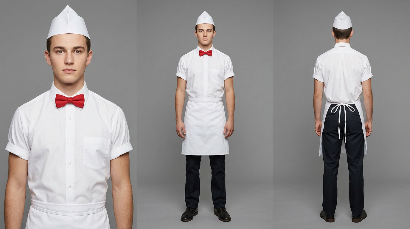
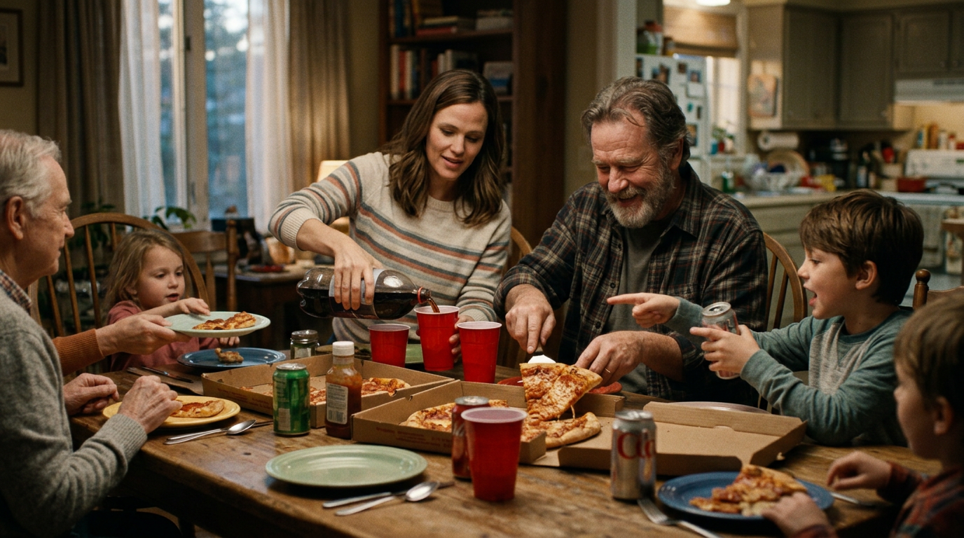
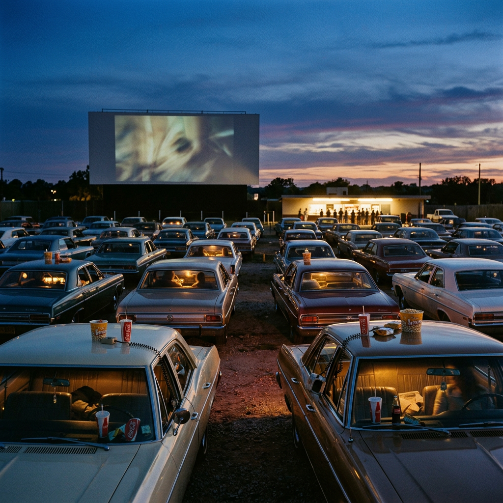
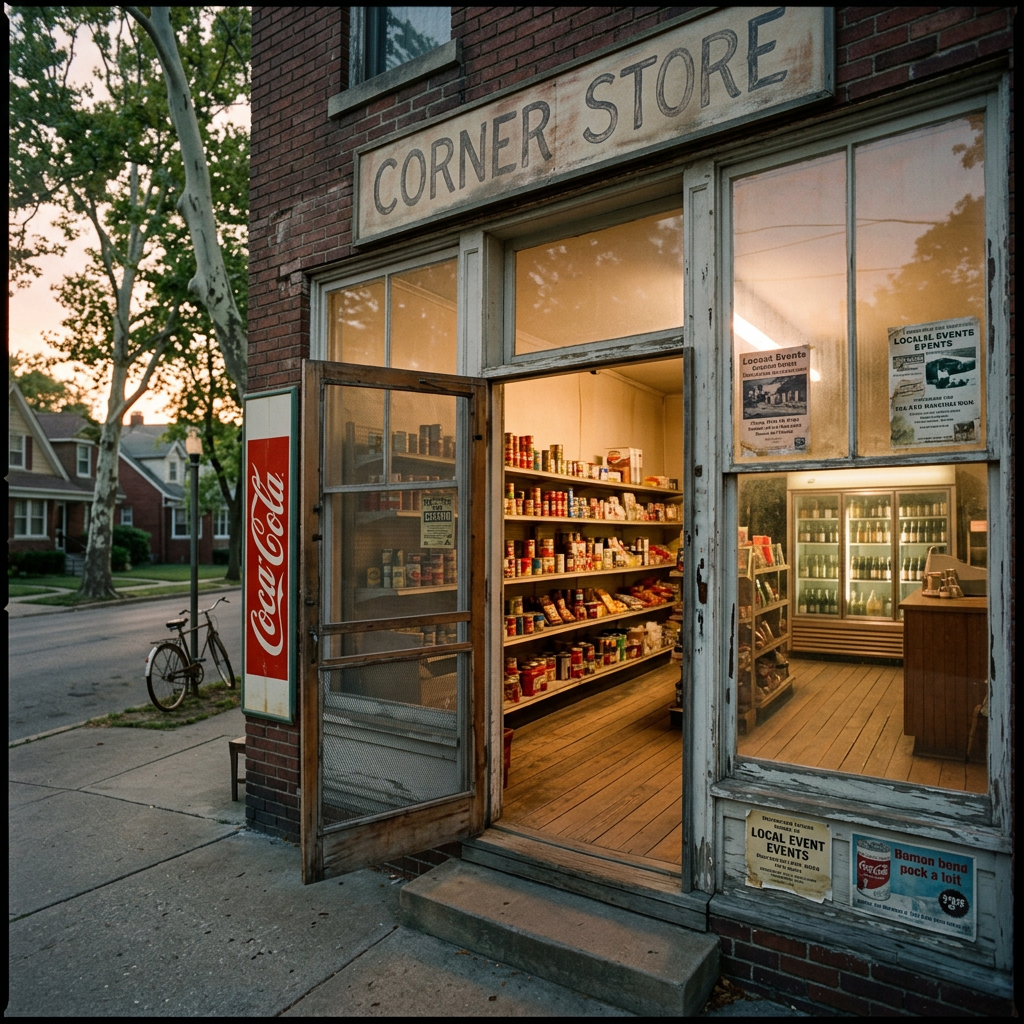
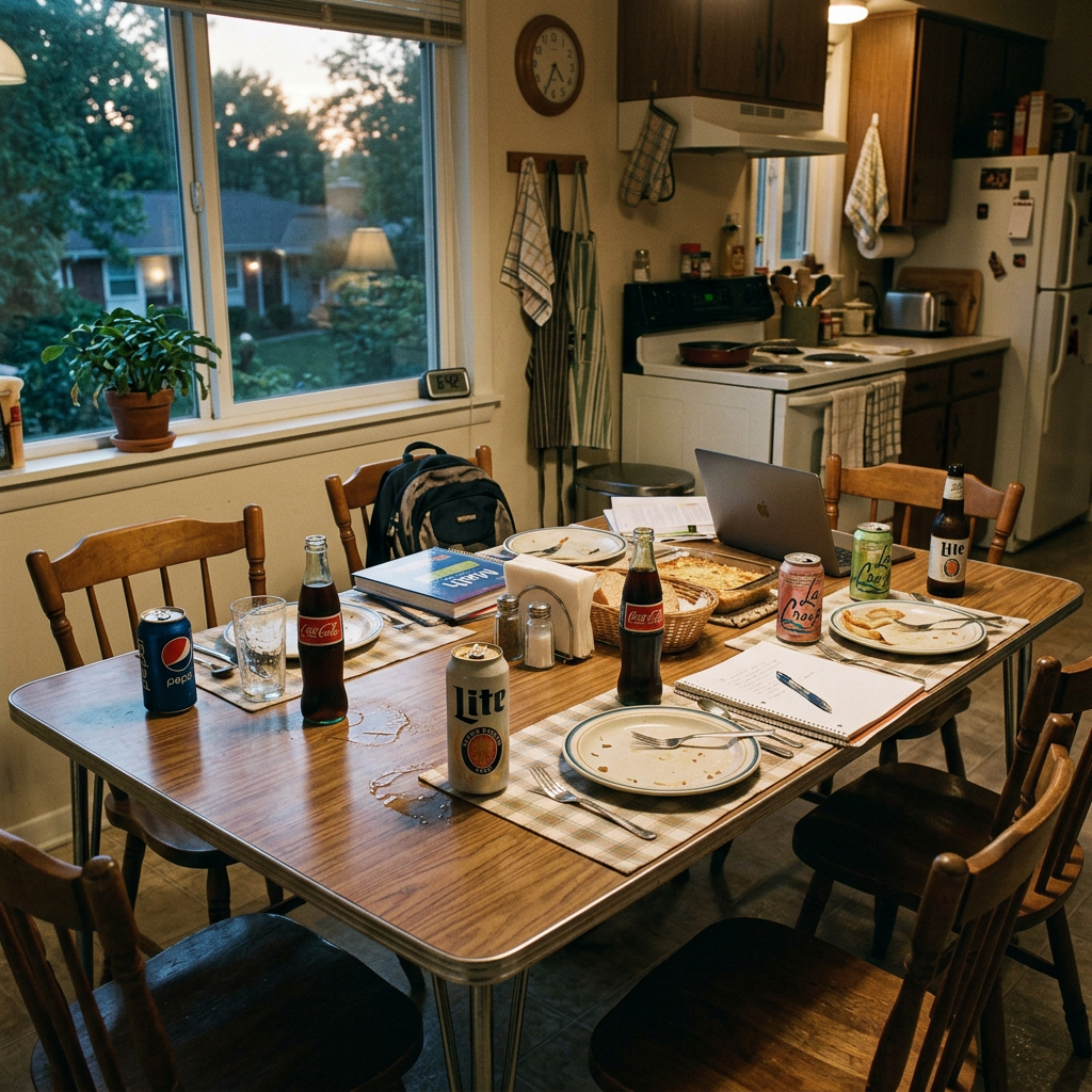
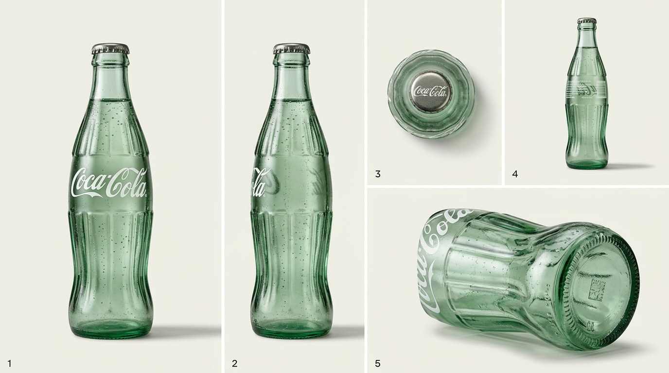
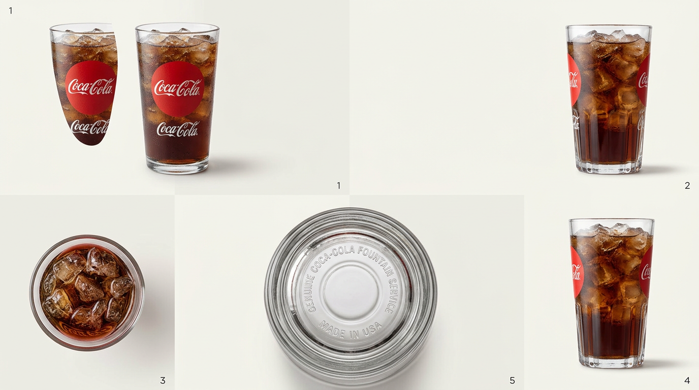
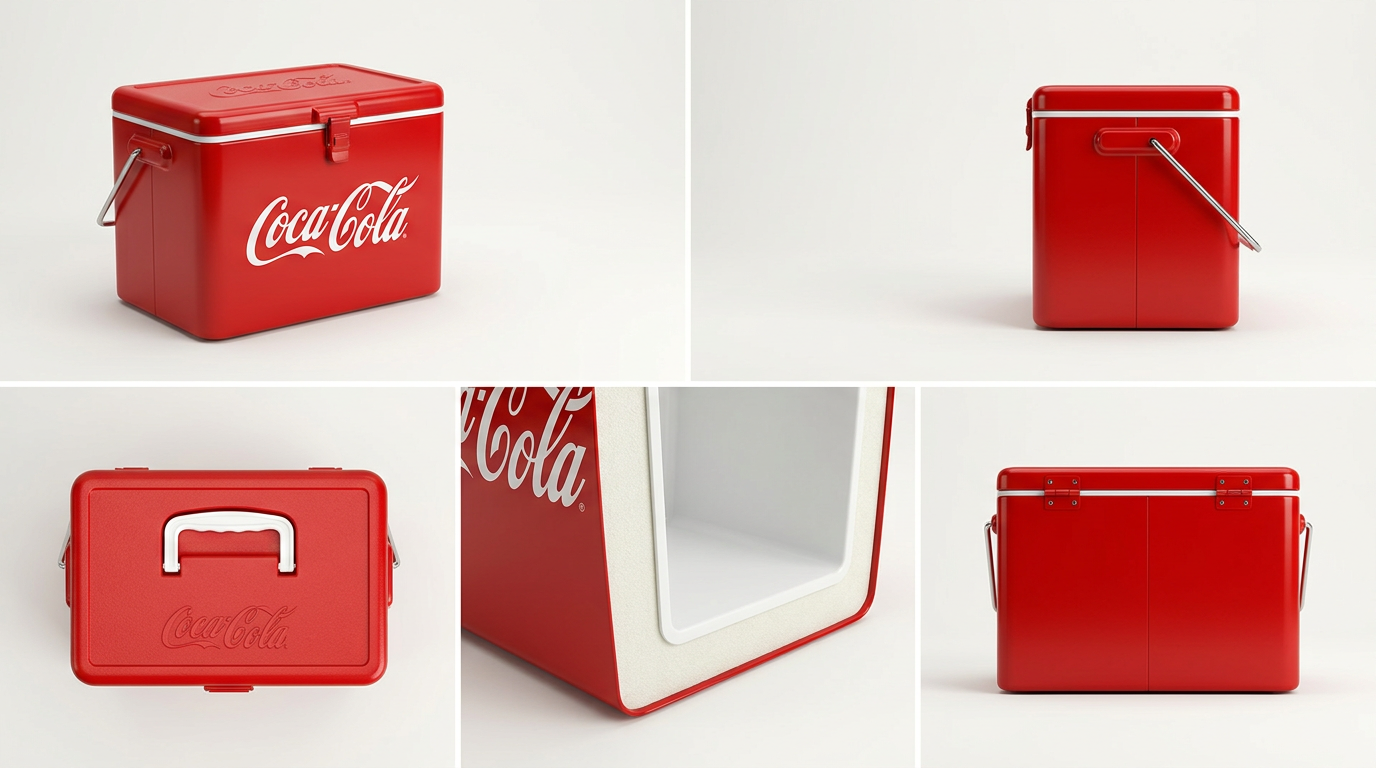
 Latest work
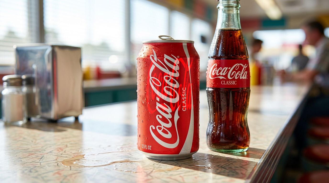
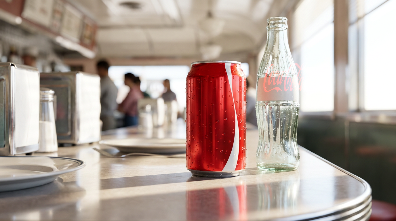
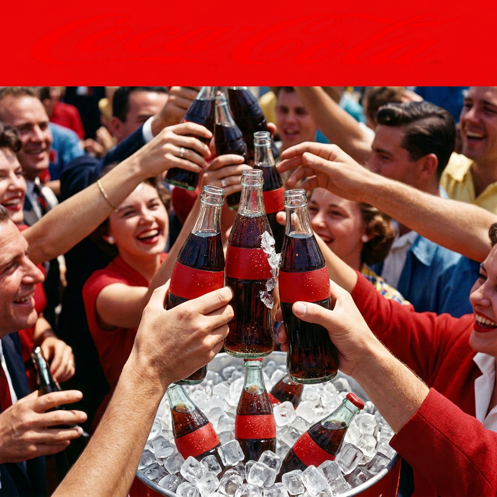
“Coca-Cola speaks in declarative present-tense celebrations, treating joy as immediate fact rather than aspiration. The voice is exclamatory without being shouty, using simple imperatives and sentence fragments that assume happiness is already here—'Open happiness,' never 'discover your moment.' Capital letters for emphasis feel like stadium announcements; lowercase feels like an invitation written on a note passed across the table.”
Market positionRun market research →
Ground truthWhat Semper has learned
Market pulse- preferenceHero ads should feature the Contour Bottle Silhouette as the primary logo lockup in final frame, isolated on clean background.
- style signalPrefers declarative, immediate tone over nostalgic framing — present-tense Americana rather than backward-looking sentiment.
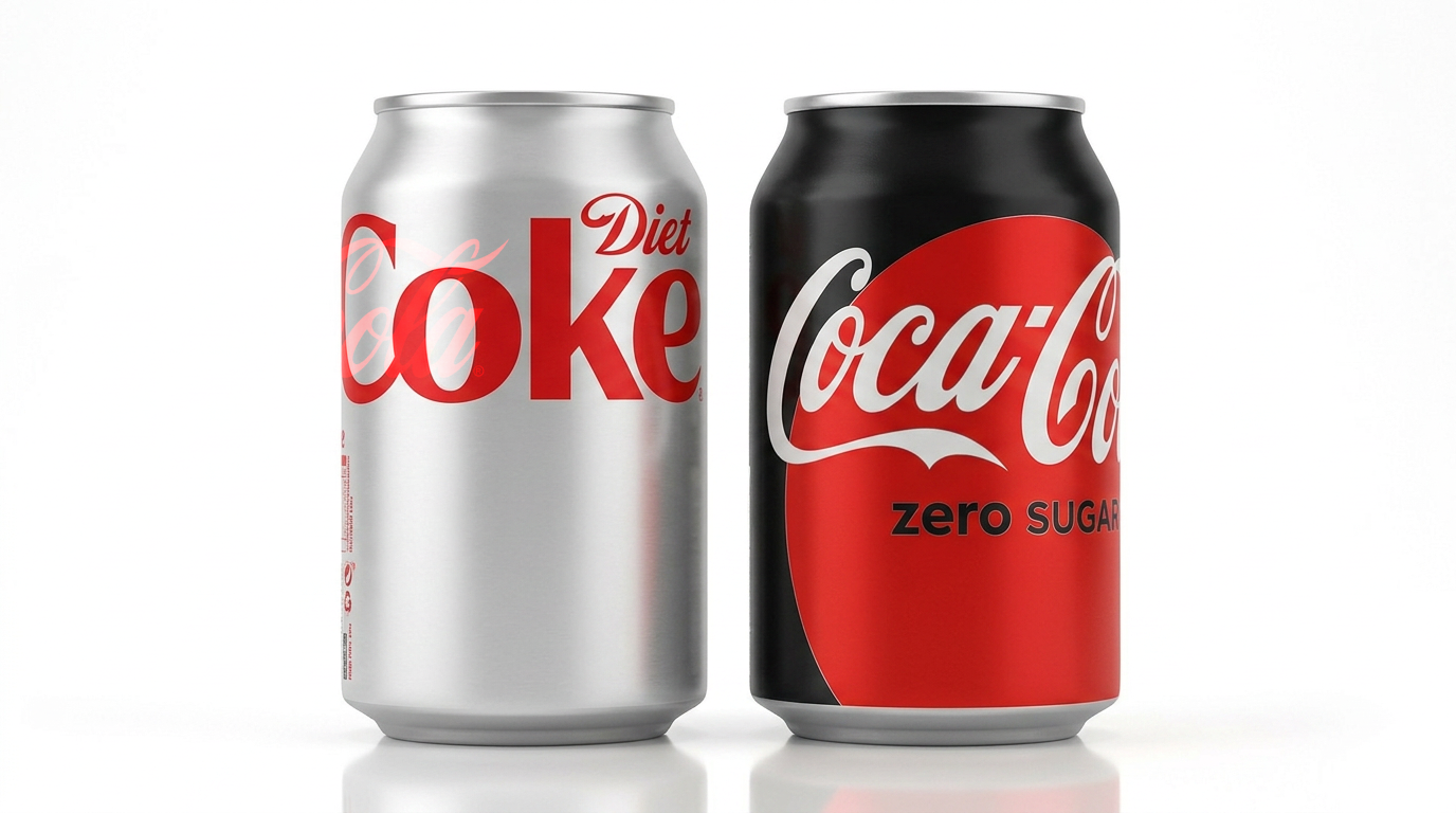
- factTeam uses multiple logos from a single inventory (Primary Spencerian Script Wordmark, Disc Logo, Contour Bottle Silhouette) that need clear spatial separation rules for product application.
- correctionLogo application on cans must not have overlapping elements — each logo should have a designated placement zone without collision.
- preferenceHero ad final frame must be Contour Bottle Silhouette centered on pure white background with tagline and CTA overlaid.
- style signalResponds well to celebratory, present-tense Americana framing that emphasizes collective ritual and immediate satisfaction over nostalgia.
Run trend research →
What Semper knows
Not checked yet — run it to see which colours, fonts and marks are actually in your materials.
Fidelitynothing judged yet this week
Weekly reports start next Monday (fidelity-report cron).
Calibration: no votes yet — scores are shown as ranks
Compiled prompts
Loading…